Closest I can remember is the C/G/G Ronald McDonald monstrosities
That was the game that "won Campbell over to Iowa State."
Maybe it's also why he hates the gold.


Follow along with the video below to see how to install our site as a web app on your home screen.
Note: This feature may not be available in some browsers.
Closest I can remember is the C/G/G Ronald McDonald monstrosities
Think his hate for that color goes back to his Toledo days.That was the game that "won Campbell over to Iowa State."
Maybe it's also why he hates the gold.
I know not everyone loved those gray uniforms but I really liked them. The anthracite was a great alt for that uniform set and it mixed and matched well. It was a nice change up to have before the new uniformsHow about C/G/G? (Oh, and the G stands for Gray.)
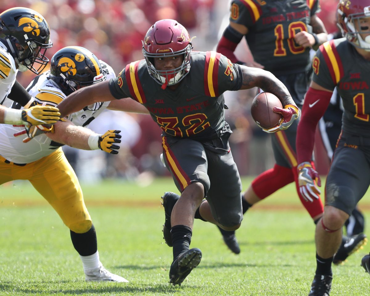
Yep, 2018 I think is what you're referencing, here is a pic from it. (I could've sworn that game was more recent).
View attachment 118084


I thought we had wore Black-white-white one time. Interesting that we have not nor Black-white-Black.If anybody was curious how the team is doing in its various looks...
I have this tracked back to 2008, but this analysis starts in 2018 because that was when the current football uniforms were introduced. So think of this as the "möbius strip" uniform numbers era...
View attachment 118079
I thought we had wore Black-white-white one time. Interesting that we have not nor Black-white-Black.
No Black-Card-Black either.
I know not everyone loved those gray uniforms but I really liked them. The anthracite was a great alt for that uniform set and it mixed and matched well. It was a nice change up to have before the new uniforms
I believe they were 0-14, then lost the 1st 14 the following year before winning their final 2 the 1st year of the 16 game schedule. I remember because my Packers were one of their 2 wins year 2.
")
The Shadow knows! Bwahahahahah!I think maybe 2022 vs. West Virginia. I'd need clarification/ confirmation.
EDIT: @theshadow beat me to it.

 www.urbandictionary.com
And then TB became the powerhouse they are known for today! LOLTB didn't defeat Green Bay until 1979 (swept the season series).
How about C/G/G? (Oh, and the G stands for Gray.)
The gray was an interesting transition, wasn't it? Was it 1 season or 2? I'm thinking 1. Anyway, never to be seen again. That's the interesting part. I guess the general fan feedback was not completely positive? Haha.
For those that remember this game, what was the thinking, the fan sentiment after seeing these?

Twitter was making fun of the uniforms calling them McDonald uniforms that even McDonald’s chimed in.For those that remember this game, what was the thinking, the fan sentiment after seeing these?
View attachment 118133
I can imagine it was pretty negative, because we haven't seen them since. And rightfully so. But kudos to Rhoads for giving it a try. I guess. LOL

IIRC, we wore those when we played Campbell (Toledo). Maybe that’s the source to his aversion of additional gold uniform combos!For those that remember this game, what was the thinking, the fan sentiment after seeing these?
View attachment 118133
I can imagine it was pretty negative, because we haven't seen them since. And rightfully so. But kudos to Rhoads for giving it a try. I guess. LOL
Twitter was making fun of the uniforms calling them McDonald uniforms that even McDonald’s chimed in.
It's interesting if you look at the following 3 images, they are all slightly different. The first one, Bibbs #11 is the best, much better than the other two. The angled stripes (accidental or intentional) look better and more aggressive. The 2nd image (player #2) is very similar but the sh stripes are not angled. The final image (#5 Allen Lazard) has the straight up & down stripes and the sh stripes are longer with the Big 12 logo just inside the Rt stripe.IIRC, we wore those when we played Campbell (Toledo). Maybe that’s the source to his aversion of additional gold uniform combos!


And yet I’ll take ugly gold over yellow every time.The fact the athletic department has never been able to stick to a good shade of gold is frustrating, every shade they've used in the past 20 years is ugly and pale.
What about GGW or YYW?It's interesting if you look at the following 3 images, they are all slightly different. The first one, Bibbs #11 is the best, much better than the other two. The angled stripes (accidental or intentional) look better and more aggressive. The 2nd image (player #2) is very similar but the sh stripes are not angled. The final image (#5 Allen Lazard) has the straight up & down stripes and the sh stripes are longer with the Big 12 logo just inside the Rt stripe.
View attachment 118137View attachment 118138View attachment 118139
Just goes to show that sometimes minor details can make a huge difference in overall appearance.
Regardless, we should never do an all-yellow, or c/y/y again, even if we got a darker gold. Just stay away from those 2 combos.
Those were atrocious. They look like something I could draw up in MS Paint. The gray piece is fine, the execution was terrible.I know not everyone loved those gray uniforms but I really liked them. The anthracite was a great alt for that uniform set and it mixed and matched well. It was a nice change up to have before the new uniforms

")
