Here may be why we should stick with the I-STATE logo and forget the twirl or bird. Below is a logo used by a school from 1971-'78 that was then replaced in 1979 and that "new" has been used nearly unchanged since. That school's new logo, though kind of unattractive in my opinion, is distinct and in its stability has created a recognizable representation of that school.
Keep that in mind if you approach our coach and the Ad. Traditional colors in a solid yet appealing depictive logo is the way to go. Some of the mock-ups here have that.
Know what school had this dumb logo?
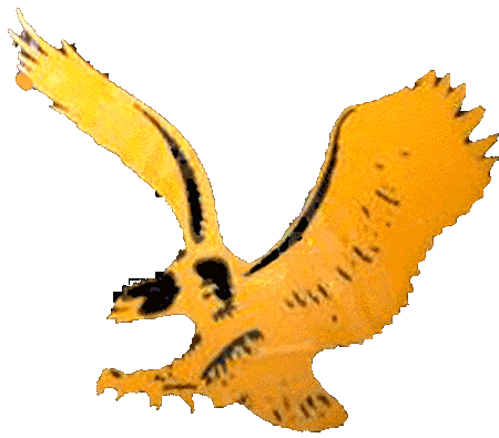
http://www.sportslogos.net/logos/view/bhbeknr2kg49s33szuh1/Iowa_Hawkeyes/1971/Primary_Logo