New Uniforms?

IMO, the 1976 through the 1978 seasons were our best uniforms ever. More of a gold color than bright yellow we have now makes all the difference. Plus, these uniforms had some white in them. I was clearly Iowa State and not USC.

Couldn't agree more.

 
IMO, the 1976 through the 1978 seasons were our best uniforms ever. More of a gold color than bright yellow we have now makes all the difference. Plus, these uniforms had some white in them. I was clearly Iowa State and not USC.

My favorite, too. Current design was obviously a nod toward that one. If they had duplicated everything about it except the helmet logo (using I-State) and the updated jersey number typeface, it'd be perfect.
 
I'm all for new jerseys. Pay Nike whatever they want. I DONT WANT TO LOOK LIKE USC ANYMORE!

Amen & AMEN!!

We tried about as much to change the USC uni as Iowa did the Steelers. If we are going to use their colors at least mix up the design more than 1 strip vs 2 strips on the jersey.

It's time to have our own identity (and then change it in a couple of years!)
 
I think it would be cool for ISU to start wearing more unique uniforms. There is very little tradition with the ISU football program. It's well known that kids today want to be in "cool" uniforms. Why not scrap the norm and start wearing cutting edge uniforms like Oregon and several other schools do? I really don't see the downside.

Personally, I think ISU could make some pretty sweet looking black uniforms. The Cyclone mascot could really inspire some creative designs.
 
People who say we look like or ripped off USC make me laugh.

6a00e54f7fc4c58833010535f1f71c970b-450wi.jpg


Yeah I really don't see the similarity :jimlad:
 

Just an opinion my man. No need to be a jerk. Chris Williams is using black to highlight the cardinal and gold in the design at the top of this website. I think it looks sharp. Black uni's are sweet, and I think it would look good outlined with ISU's colors.
 
  • Like
Reactions: ThurgoodMarshal
Just an opinion my man. No need to be a jerk. Chris Williams is using black to highlight the cardinal and gold in the design at the top of this website. I think it looks sharp. Black uni's are sweet, and I think it would look good outlined with ISU's colors.

Right on, man. & I think the hawks would look really sharp with some red jerseys:
EP-302259977.jpg&MaxW=650&MaxH=420
 
Right on, man. & I think the hawks would look really sharp with some red jerseys:

EP-302259977.jpg&MaxW=650&MaxH=420

Look... if you want Iowa fans to stop with the "little brother" comments then stop with the "little brother" mentality. You don't have to compare everything to Iowa. Just because Iowa has black home jerseys doesn't mean ISU can't have an alternate jersey combination that is black. They would look nothing alike.

I think most people in general agree that black jerseys are sharp looking. With ISU's color combination I think they could create some pretty sweet jerseys that the players would love to wear. An all red combination would be neat as well. Kind of like back when Seneca was around.
 
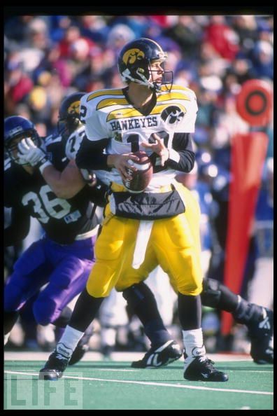
So I was googling worst college football uniforms and came across this little gem. I had completely forgotten about this retina-melting Hawkeye uniform from the early-mid 90's.

202862.jpg
 
I think a Gun Metal Gray alternate uni would look sharp. Our cardinal IState logo, trimmed in gold/yellow (current shade) on a GMG helmet would really stand out and probably look sharp on TV. Likewise, have cardinal numbers on the jersey's and cardinal stripes on the pants - all trimmed in the gold/yellow.

I think someone did a rough mock up of a GMG helmet on one of the past "new helmet" threads.
 
I like the design in the top picture but the colors should match the bottom picture. More yellow, less gold.
 
Think they will ever bust out those as a throwback look?
:smile:

Ughh thanks for the reminder :shocked:

If they did do a throwback version of the wings it would be funny. They could probably pull it off a lot better now days with the designs Nike has. Whomever thought they could squeeze both the word "Hawkeyes" and the Hawk Logo on the chest was a complete moron. What a messy design.
 
Just an opinion my man. No need to be a jerk. Chris Williams is using black to highlight the cardinal and gold in the design at the top of this website. I think it looks sharp. Black uni's are sweet, and I think it would look good outlined with ISU's colors.

Welcome to the internet. It's mostly jerks. CF is better than a lot of places out there but you still have to take every post with a grain of salt. I've noticed that it's mostly just fat married dudes looking for a place to vent so they don't strangle their kids.

Anyway, back to your original post. It really is a stretch for ISU to go with black unis. Personally, I think most black unis look pretty weak anyway. Either way, we would be arguing over a personal preference. If we went with non-traditional uniform colors, you might be able to talk be into a dark gray...

okst-11-12-allgrey-richardrowe-620x885.jpg
 

Help Support Us

Become a patron
