
IMO, the 1976 through the 1978 seasons were our best uniforms ever. More of a gold color than bright yellow we have now makes all the difference. Plus, these uniforms had some white in them. I was clearly Iowa State and not USC.
Couldn't agree more.


Follow along with the video below to see how to install our site as a web app on your home screen.
Note: This feature may not be available in some browsers.
IMO, the 1976 through the 1978 seasons were our best uniforms ever. More of a gold color than bright yellow we have now makes all the difference. Plus, these uniforms had some white in them. I was clearly Iowa State and not USC.

IMO, the 1976 through the 1978 seasons were our best uniforms ever. More of a gold color than bright yellow we have now makes all the difference. Plus, these uniforms had some white in them. I was clearly Iowa State and not USC.

I'm all for new jerseys. Pay Nike whatever they want. I DONT WANT TO LOOK LIKE USC ANYMORE!

Personally, I think ISU could make some pretty sweet looking black uniforms.

People who say we look like or ripped off USC make me laugh.


Yeah I really don't see the similarity
Yeah I really don't see the similarity
Go away.
Just an opinion my man. No need to be a jerk. Chris Williams is using black to highlight the cardinal and gold in the design at the top of this website. I think it looks sharp. Black uni's are sweet, and I think it would look good outlined with ISU's colors.

Right on, man. & I think the hawks would look really sharp with some red jerseys:
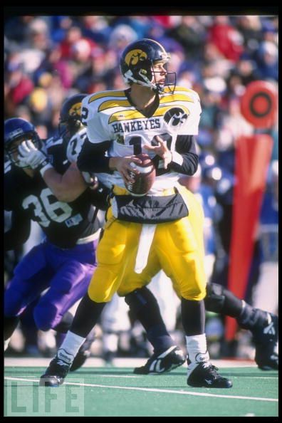

So I was googling worst college football uniforms and came across this little gem. I had completely forgotten about this retina-melting Hawkeye uniform from the early-mid 90's.

So I was googling worst college football uniforms and came across this little gem. I had completely forgotten about this retina-melting Hawkeye uniform from the early-mid 90's.

Think they will ever bust out those as a throwback look?
:smile:
Think they will ever bust out those as a throwup look?
:smile:
Just an opinion my man. No need to be a jerk. Chris Williams is using black to highlight the cardinal and gold in the design at the top of this website. I think it looks sharp. Black uni's are sweet, and I think it would look good outlined with ISU's colors.


