And a hurricane isn't an ibis!A crimson tide isn't an elephant and cardinal isn't a tree so theres that.


No forums found...
Site Related
Iowa State
College Sports
General - Non ISU
CF Archive
Install the app
How to install the app on iOS
Follow along with the video below to see how to install our site as a web app on your home screen.
Note: This feature may not be available in some browsers.
New Uniforms Revealed
- Thread starter CyTwins
- Start date
No forums found...
Site Related
Iowa State
College Sports
General - Non ISU
CF Archive
You are using an out of date browser. It may not display this or other websites correctly.
You should upgrade or use an alternative browser.
You should upgrade or use an alternative browser.

In the 90s we added Blue as a school color, then removed it with the current logo set.
Because so many people seem to have a problem with black... Because "its not our color" or whatever. White isnt our color either but we still wear that too, and amazingly no one cares.
With this in mind should we just add Black to our color set, then all those complaining will be happy?
A lot of schools have alternate colors and even more have a Blackout version, but for some reason our fans, and TOE fans seem to have a fit if we dare wear something alternative to our official colors.

In the 90s we added Blue as a school color, then removed it with the current logo set.
Because so many people seem to have a problem with black... Because "its not our color" or whatever. White isnt our color either but we still wear that too, and amazingly no one cares.
With this in mind should we just add Black to our color set, then all those complaining will be happy?
A lot of schools have alternate colors and even more have a Blackout version, but for some reason our fans, and TOE fans seem to have a fit if we dare wear something alternative to our official colors.
That blue in the 90s was a atrocity. That really killed my purchasing of cyclone gear until that fad was over.
Because so many people seem to have a problem with black... Because "its not our color" or whatever. White isnt our color either but we still wear that too, and amazingly no one cares.
Doesn't everybody have to have white? Why are you comparing it to black?
Iowa piles on because they live in their special little vacuum and have to reach for anything at all that makes them feel relevant, special, and slighted. It’s exhausting.In the 90s we added Blue as a school color, then removed it with the current logo set.
Because so many people seem to have a problem with black... Because "its not our color" or whatever. White isnt our color either but we still wear that too, and amazingly no one cares.
With this in mind should we just add Black to our color set, then all those complaining will be happy?
A lot of schools have alternate colors and even more have a Blackout version, but for some reason our fans, and TOE fans seem to have a fit if we dare wear something alternative to our official colors.
I think the black and white combos are next levelI'd like to see W/B/B sometime, but put the cardinal and gold I-State logo on the helmet instead of the all black logo.
The point is, white is an official color of many schools, even though yeah everyone needs to have a white or contrasting jersey, some schools still choose to make that an official color. Only having say blue and white or similar.Doesn't everybody have to have white? Why are you comparing it to black?
I am also not saying the blue was a favorite of mine, but if it is that easy to just add an official color, maybe we should, it would shut up those that think it is so offensive to wear something other than our official color. Black can be an accent just like the blue of the 90s.
Do I think it is necessary, no not really. Just sick of those constantly complaining about the black, even though most schools have a black version now days.
I don't think it has much to do with "official" colors - it's more a question of if it makes senseThe point is, white is an official color of many schools, even though yeah everyone needs to have a white or contrasting jersey, some schools still choose to make that an official color. Only having say blue and white or similar.
I am also not saying the blue was a favorite of mine, but if it is that easy to just add an official color, maybe we should, it would shut up those that think it is so offensive to wear something other than our official color. Black can be an accent just like the blue of the 90s.
Do I think it is necessary, no not really. Just sick of those constantly complaining about the black, even though most schools have a black version now days.
Unfortunately, I believe we're in an era where it makes sense for every team to have a BFBS or GFBS or whatever uniform b/c the players like them
'croots aside, IMO there are very few reasons to have a BFBS or GFGS uniform
The blue wasn't the primary atrocity with that logo and unis, it was the red deviating from the proper Cardinal shade.That blue in the 90s was a atrocity. That really killed my purchasing of cyclone gear until that fad was over.
It is definitely time to get new FB unis. Never did like the existing Nike template especially when compared to the Nike templates at Okie St and TCU whose uni combos are so much better looking than ISU's.
Their color combos help out more than anything, imo.The blue wasn't the primary atrocity with that logo and unis, it was the red deviating from the proper Cardinal shade.
It is definitely time to get new FB unis. Never did like the existing Nike template especially when compared to the Nike templates at Okie St and TCU whose uni combos are so much better looking than ISU's.
True. Still think there’s room for various helmet decals… walking Cy, cursive Cyclones, the Jack Trice logo. I’m sure there’s brand importance to the I State logo but a decal is an inexpensive way to mix things upTheir color combos help out more than anything, imo.
“Orrnado” also!True. Still think there’s room for various helmet decals… walking Cy, cursive Cyclones, the Jack Trice logo. I’m sure there’s brand importance to the I State logo but a decal is an inexpensive way to mix things up
The OG I.A.C. against Iowa to take a shot at ANF.True. Still think there’s room for various helmet decals… walking Cy, cursive Cyclones, the Jack Trice logo. I’m sure there’s brand importance to the I State logo but a decal is an inexpensive way to mix things up
The navy blue was great. Goddamn, as a kid born in the 80’s, by the mid-90’s I was full blown psycho Cyclone fan and the morning I saw the new logos announced in the Des Moines Register nearly blew my young mind. That logo set is so damn creative and extensive. Yes, it’s cartoony - it was absolutely perfect for its time.The blue wasn't the primary atrocity with that logo and unis, it was the red deviating from the proper Cardinal shade.
It is definitely time to get new FB unis. Never did like the existing Nike template especially when compared to the Nike templates at Okie St and TCU whose uni combos are so much better looking than ISU's.
The EARLY uniforms using the tertiary blue were fantastic and the color and scheme and design were really well done - i.e. the 95-97 football uniforms, the 95-98 basketball uniforms, the redesign for 98-98, the Adidas iterations from 99-03).
Honestly, what RUINED our school colors and the blue and basically everything was the initial Nike contract in ~2003. Holy sh*t I’m still pissed whoever signed that, we basically got low-high school level uniform templates (and quality) in every sport. It wasn’t until the Chizik redesign for football when we got real football uniforms (believe they did or maybe still do refer to the level as “Nike Elite”) and it wasn’t until Gmac’s final year where basketball got a true ‘Elite’ level template - and even that template was a rip off of Michigan State, who had already moved on to the next/better/newer Nike uniform structure.
Would love for us to get a better design for football but it seems like the cost effective thing to do is to stick with solid colors with no extra striping, design, etc. Like many other schools getting ‘new’ Nike uniforms, many are doing away with stripes/designs on the pants. Cincinnati for example got new Nike threads this year and same deal - no striping, nothing crazy custom, etc.
For MBB, I really like our current template. The piping/sides seem to be ‘custom’ with an attempt to mimic a tornado. All the combos look good. I especially love the gold “Cyclones” on the home whites.
What do you all think about the Kansas Maui uniforms?
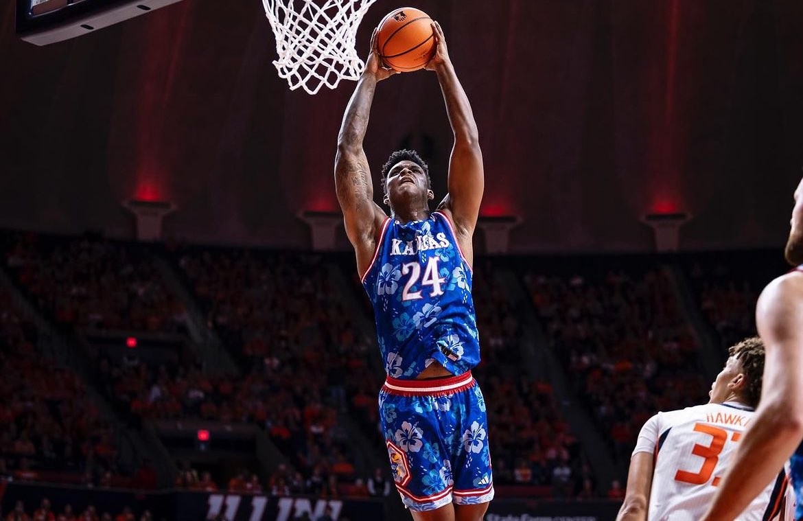

I think it is a creative idea, but I think the jerseys and the shorts both in the floral is a bit much. For Kansas they should have gone with shorts that look like Daisy Dukes.
Would you buy a similar ISU jersey next year when ISU goes to Maui? I'd like the see ISU do something like this maybe with solid shorts.
These are amazing and I would have to buy some floral ISU gear if it was offered. Hell, I already have an ISU Tommy Bahama Hawaiian shirt, so this is right up my (cyclone) alley.What do you all think about the Kansas Maui uniforms?
I think it is a creative idea, but I think the jerseys and the shorts both in the floral is a bit much. For Kansas they should have gone with shorts that look like Daisy Dukes.
Would you buy a similar ISU jersey next year when ISU goes to Maui? I'd like the see ISU do something like this maybe with solid shorts.
Last edited:
It does nothing to improve their image for me.What do you all think about the Kansas Maui uniforms?
I think it is a creative idea, but I think the jerseys and the shorts both in the floral is a bit much. For Kansas they should have gone with shorts that look like Daisy Dukes.
Would you buy a similar ISU jersey next year when ISU goes to Maui? I'd like the see ISU do something like this maybe with solid shorts.
Kansas must be destroyed, even if a few flowers are sacrificed.
I've noticed it depends on what number you have. Any 8 or 9 looks terrible because they are smashed together. The fact that most of the players with those numbers are handfighting all game, and you can't tell who is who out there. But if you look at Ebel (47), his numbers look smaller and much better. Obviously the single numbers look better than an 88/89.Disagree. Loved the black collar. Those initial jerseys had smaller numbers too, and this looked much better than the current ones. The current unis with the larger numbers look baggy and wrinkled, they don’t “fit” well over pads like the initial ones did. Similar to when at some point the Paul Rhoads unis got updated by Nike (maybe ‘13 or ‘14?) with crazy stupid oversized shoulder stripes and horribly stretched/larger numbers. They looked terrible and didn’t fit well either. Goodness those extended/long shoulder stripes looked really, really bad.
We just need a decent font style update from Nike and add white trim instead of a darker cardinal.
I didn't love the black collar at the time, but now that black is basically our third color, I'd be fine with it returning.
Yep, our biggest issue is cardinal and gold don't look great together without something to soften the contrast (white/black).Their color combos help out more than anything, imo.