

No forums found...
Site Related
Iowa State
College Sports
General - Non ISU
CF Archive
Install the app
How to install the app on iOS
Follow along with the video below to see how to install our site as a web app on your home screen.
Note: This feature may not be available in some browsers.
New Uniforms Revealed
- Thread starter CyTwins
- Start date
No forums found...
Site Related
Iowa State
College Sports
General - Non ISU
CF Archive
You are using an out of date browser. It may not display this or other websites correctly.
You should upgrade or use an alternative browser.
You should upgrade or use an alternative browser.
So Memphis has a helmet with their area code on it (901). Not a fan. I will be disappointed if the Clones ever run out with 515 on their helmets.Looks like ISU is the home team in Memphis (ironic...)
What would be everyone's choice for the uni-matchup?
My pick: BBW vs CCW - color vs color - red vs blue - I think this would be really cool
View attachment 120246
View attachment 120247
This game is going to be several GBs - why can't they include ALL uniform elements for a couple extra MBs? (I know, probably to sell them in DLCs...  )
)
 clutchpoints.com
)
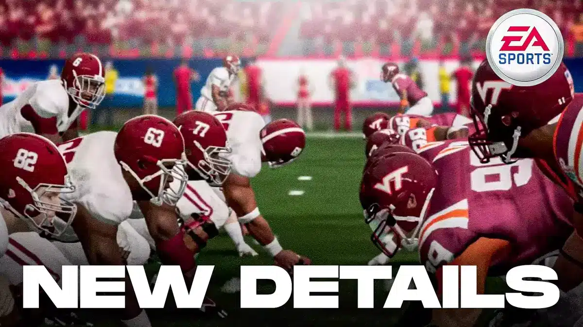
New Report Emerges on EA Sports College Football Uniforms
A new report on EA Sports College Football surfaced recently, noting possible details with School Uniforms and Helmets in game.
Area Codes are a big thing in the south.So Memphis has a helmet with their area code on it (901). Not a fan. I will be disappointed if the Clones ever run out with 515 on their helmets.
Wonder if those sleeve stripes are any indication of what the game jersey is going to look like
Wonder if there's a plan for blue throwbacks... ?
A little off-topic, but has there been any mention of ISU's apparel contract with Nike and if the school will renew? I believe I saw it expires June 30th 2024, but that was a DSM Register article from 2016 and haven't seen anything else about it.

IMO - Boise looked like THE BRONCOS last night - a great & rarely used combo - this is what the DENVER BRONCOS should look like
Also, UCLA's gold facemasks on gold helmets looks great!
At one point my fiance asked if I was watching this game just b/c the "costumes" look better than Tech/Cal
Yes, yes I was

Also, UCLA's gold facemasks on gold helmets looks great!
At one point my fiance asked if I was watching this game just b/c the "costumes" look better than Tech/Cal
Yes, yes I was

IMO - Boise looked like THE BRONCOS last night - a great & rarely used combo - this is what the DENVER BRONCOS should look like
Also, UCLA's gold facemasks on gold helmets looks great!
At one point my fiance asked if I was watching this game just b/c the "costumes" look better than Tech/Cal
Yes, yes I was
View attachment 120884
That is a sharp-looking uniform. And it was a good contrast between the uniforms for that game.
It helps visually, too, when Boise isn't playing on blue turf. Most of its uni combos blend into the background.
This will always be the ultimate Boise State look...

Easy solution to new unis: Copy Commanders Nike template for Cardinal, Gold, White and Black (when used). Helmets remain as-is with one change: use Punching Cy at times on white helmet. Number font can also remain as is.
 www.nfl.com
Washington Commanders Unveil New Uniforms
The official source for NFL news, video highlights, fantasy football, game-day coverage, schedules, stats, scores and more.
www.nfl.com
Last edited:

UCLA has accomplished more with gold than isu.IMO - Boise looked like THE BRONCOS last night - a great & rarely used combo - this is what the DENVER BRONCOS should look like
Also, UCLA's gold facemasks on gold helmets looks great!
At one point my fiance asked if I was watching this game just b/c the "costumes" look better than Tech/Cal
Yes, yes I was
View attachment 120884
Legendary
With a few small tweaks, I don't think this would be a bad thingEasy solution to new unis: Copy Commanders Nike template for Cardinal, Gold, White and Black (when used). Helmets remain as-is with one change: use Punching Cy at times on white helmet. Number font can also remain as is.
Washington Commanders Unveil New Uniforms
The official source for NFL news, video highlights, fantasy football, game-day coverage, schedules, stats, scores and more.
Did the just copy Minnesota, flip the M and switch out "Gophers" for "Commanders" ?Easy solution to new unis: Copy Commanders Nike template for Cardinal, Gold, White and Black (when used). Helmets remain as-is with one change: use Punching Cy at times on white helmet. Number font can also remain as is.
Washington Commanders Unveil New Uniforms
The official source for NFL news, video highlights, fantasy football, game-day coverage, schedules, stats, scores and more.
Nothing about the Commies uniforms should be emulated by anybody.
I don't think black uniforms with red and yellow trim looks that great. Too busy. Imo.
No, ISU currently has same drab template as the Rodents. Commanders have different shoulder stripes with white that would enhance new ISU unis.Did the just copy Minnesota, flip the M and switch out "Gophers" for "Commanders" ?
I was more commenting on the color scheme and "W" vs "M" symbol. The maroon aligns a lot more with Minny than ISUNo, ISU currently has same drab template as the Rodents. Commanders have different shoulder stripes with white that would enhance new ISU unis.
I would venture that neither has the umpteen shades of red that we see in our standsDid the just copy Minnesota, flip the M and switch out "Gophers" for "Commanders" ?
The ISU version would be black and white only with white shoulder stripes.I don't think black uniforms with red and yellow trim looks that great. Too busy. Imo.