

No forums found...
Site Related
Iowa State
College Sports
General - Non ISU
CF Archive
Install the app
How to install the app on iOS
Follow along with the video below to see how to install our site as a web app on your home screen.
Note: This feature may not be available in some browsers.
New NFL logo question
- Thread starter JP4CY
- Start date
No forums found...
Site Related
Iowa State
College Sports
General - Non ISU
CF Archive
You are using an out of date browser. It may not display this or other websites correctly.
You should upgrade or use an alternative browser.
You should upgrade or use an alternative browser.
I agree with the logo designer. They should flush LA down the toilet.
Also they might get a couple sell outs if they share the fan base.
Also they might get a couple sell outs if they share the fan base.
Funny how the Rams and Chargers are both moving off navy/dark blue and onto royal blue and powder blue, respectively, at the same time over this.
Not that I am complaining -- not sure about the logos and uniforms, but the color choices are definitely improvements to go back to their classic ones.
Not that I am complaining -- not sure about the logos and uniforms, but the color choices are definitely improvements to go back to their classic ones.
Timeless looks like Chiefs, Packers, Cowboys, Raiders >>> Constantly changing looks like Bucs, Falcons, Browns, Jaguars
The mismatched silver helmet and "mint" pants drives me nuts.
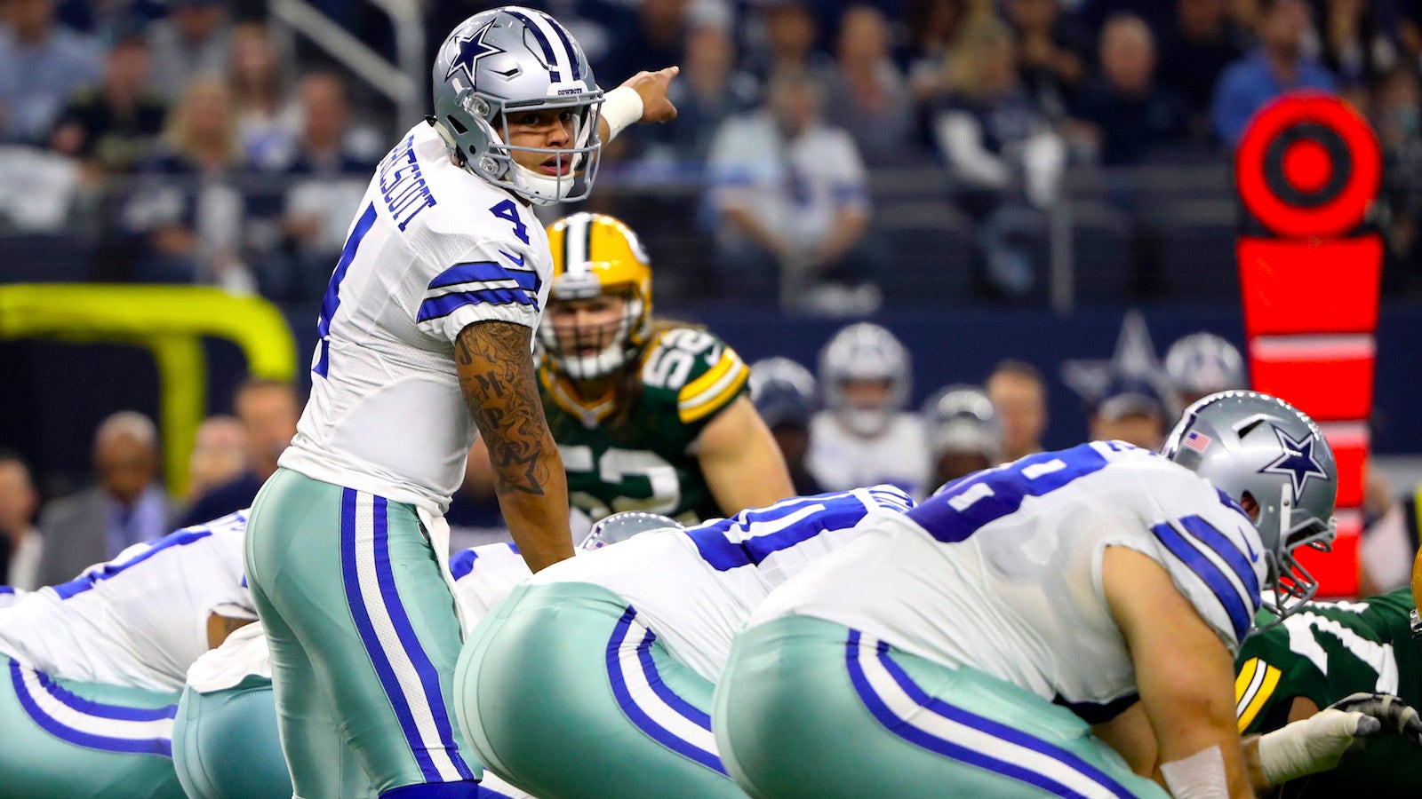
The navy star on the helmet is different than the royal blue throughout, too.
They need to pick a single silver and a single blue shade already.
If they did that, they would be great... but there are just these stupid problems.
The mismatched silver helmet and "mint" pants drives me nuts.
The navy star on the helmet is different than the royal blue throughout, too.
They need to pick a single silver and a single blue shade already.
If they did that, they would be great... but there are just these stupid problems.
Yeah I'm not sure when they went away from the true gray pants and brightened the numeral colors (didn't happen at the same time, I don't think).
Timeless looks like Chiefs, Packers, Cowboys, Raiders >>> Constantly changing looks like Bucs, Falcons, Browns, Jaguars
Falcons haven't changed their unis in 18 years. Not sure what's "constantly changing" about that. Although they badly need to.
Chargers "tease":
That's actually not a bad refresh, despite nobody in LA caring.
The mismatched silver helmet and "mint" pants drives me nuts.
The navy star on the helmet is different than the royal blue throughout, too. They need to pick a single silver and a single blue shade already./QUOTE]
Although lighting in a photo can have some effect, this look from the '70s matches the elements much better.

Yeah, I wish they would go back to a consistent gray/silver (and not the "mint" silver with some green of the current pants) and royal blue and drop the navy.
Something like this --


I know designers and have worked closely with designers for 20ish years and from my experience working with them logo design is one of the biggest headf**** there is. People are always going to be pissed, and they take it very personally.
I actually don't think the Rams ones are that bad. The worst logos are the overdesigned, overly complicated things that have details you need a magnifying glass to make out.
Either way, it's a total lose/lose endeavor.
I actually don't think the Rams ones are that bad. The worst logos are the overdesigned, overly complicated things that have details you need a magnifying glass to make out.
Either way, it's a total lose/lose endeavor.
If New England or Tampa Bay change unis - I suggest the true classics (the ones that were in style when I was in HS):


The mismatched silver helmet and "mint" pants drives me nuts.
The navy star on the helmet is different than the royal blue throughout, too.
They need to pick a single silver and a single blue shade already.
If they did that, they would be great... but there are just these stupid problems.
Cowboy fan here, there is actually a reason for the different shades on the uniforms. It was for black and white TVs. They worked with a designer to find colors that appeared more silver instead of gray on old black and white television. The different materials required different colors to achieve that. Now its tradition to have the different colors.
Cowboy fan here, there is actually a reason for the different shades on the uniforms. It was for black and white TVs. They worked with a designer to find colors that appeared more silver instead of gray on old black and white television. The different materials required different colors to achieve that. Now its tradition to have the different colors.
Yeah, I am familiar with the original reason for it.
I would ask back then --
If you like the mint green pants as a tradition, why not embrace it fully and match the helmet to them? Why not lean into it? I could appreciate the team riding with that color for its uniqueness and that bit of trivia about their history instead of the gray/silver that numerous other teams (e.g., Patriots, Raiders, Giants) have in their looks.
The "looks better on TV" argument is long since obsolete. Modern screens can represent essentially any color perfectly nowadays. When it was a poor design decision for an obsolete reason, it is time to move away from it. I really do not care if they pick navy/royal blue or gray-silver or mint-silver, just that they pick one set and stick with it.
Pains me as a NY football Giants fan to say, but I like the story behind it and that they've stuck with it out of tradition. I'd be willing to bet that back then they probably didn't have the option of helmets with that color variation. Could be wrong.
Pains me as a NY football Giants fan to say, but I like the story behind it and that they've stuck with it out of tradition. I'd be willing to bet that back then they probably didn't have the option of helmets with that color variation. Could be wrong.
I am sure they do now.
I am sure they do now.
No doubt. Imagine the uproar that would come from Cowboys fans if they changed it up now. I'm guessing they'd get killed.
No doubt. Imagine the uproar that would come from Cowboys fans if they changed it up now. I'm guessing they'd get killed.
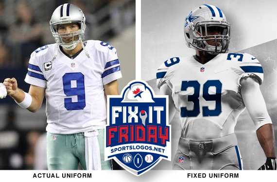
Again, I respect the tradition, but the one on the right looks so much better.
Again, I respect the tradition, but the one on the right looks so much better.
I agree it looks better. Would be curious to see how Cowboys fans polled.