

No forums found...
Site Related
Iowa State
College Sports
General - Non ISU
CF Archive
Install the app
How to install the app on iOS
Follow along with the video below to see how to install our site as a web app on your home screen.
Note: This feature may not be available in some browsers.
New Uniforms Revealed
- Thread starter CyTwins
- Start date
No forums found...
Site Related
Iowa State
College Sports
General - Non ISU
CF Archive
You are using an out of date browser. It may not display this or other websites correctly.
You should upgrade or use an alternative browser.
You should upgrade or use an alternative browser.

These are SO much better than their usual uniforms.
Very true. And yet, no color pics can be found (easily) of the ISU football teams from the '50's to early to mid (even late) '60s. We take color for granted now, not so much back then, even in to the '70's and early '80's.
Even widerightnattylite couldn't find color pics in this article.

RANKED: The Top 20 Iowa State Football Jerseys
This is not a helmet ranking, or a pant ranking. It’s a ranking on the meat of a uniform sandwich, the shirt.www.widerightnattylite.com
I will keep my eyes open but I don't have great confidence in finding anything.
My god those gold jerseys in #5 and the anthracite unis are so awful. I'd forgotten how disgusting those are.

Another throwback uniform game:
Rolling back the one shell rule opens up so many options for throwbacks
Here is a color vid:
Easily the best ISU uniforms ever! Not even close.
I'll give credit for trying the gold, but it should be near the bottom.My god those gold jerseys in #5 and the anthracite unis are so awful. I'd forgotten how disgusting those are.
At least it's Iowa State colors. Somehow anthracite is ranked 6 slots above the 73-78 home jerseys .... that kind of invalidates the list. I'd put those last.
I'm rooting for Brock Purdy too, but screw the 49ers otherwise.Easily the best ISU uniforms ever! Not even close.

Another throwback uniform game:
The Seahawks current navy blue and neon green uniforms are hideous.
They should have never left those beauties behind.
It just screams Pacific Northwest -- blue for the water, green for the trees, silver for the fog, and a Hawk's head that is respectful of totem pole iconography without the scowl that makes my eyes roll.
Yes, and their modern uniforms incongruously ooze that psychedelic neon green/yellow yuck. Or whatever you call those colors.The Seahawks current navy blue and neon green uniforms are hideous.
They should have never left those beauties behind.
It just screams Pacific Northwest -- blue for the water, green for the trees, silver for the fog, and a Hawk's head that is respectful of totem pole iconography without the scowl that makes my eyes roll.
The new is most definitely not better than the old, in this case..
Yes, and their modern uniforms incongruously ooze that psychedelic neon green/yellow yuck. Or whatever you call those colors.
The new is most definitely not better than the old, in this case..
Just to prove I'm not some old fuddy-duddy... a list of "newer" NFL uniforms I like...
The red-white-blue Pat Patriot look is a classic for a reason, but I think their Brady-era uniforms (either navy over silver or white over navy) were good for what they were -- that is, 1990s redesigns.
The original Titans look (white helmet, navy over white and white over light blue) kicks the current one around the block. Still a very 90s look, but at least it isn't a navy leotard like now.
I think the Texans had a good identity and look -- should wear red socks with blue pants, though.
I think the new Broncos' uniforms are pretty good assuming they do orange/white and avoid all-blue.
I've never understood the love for the old Eagles look. You know, the one with the kelly green and the silver pants and all sorts of striping on the sleeves and socks. I know the current look is 90s but it comes together. It could maybe benefit from a pair of silver pants to reduce the harshness of the white.
The current Vikings look is a tasteful update of their classic look.
I know there's a lot of nostalgia about the camp appeal of the Buccaneers' creamsicle, but I've never been sold on that look. Their red/pewter identity is more generic and very 90s but pleasing.
Of course, I do think everybody else either has a classic look or should return to one.
")
Cheers to your uniform dedication!Just to prove I'm not some old fuddy-duddy... a list of "newer" NFL uniforms I like...
The red-white-blue Pat Patriot look is a classic for a reason, but I think their Brady-era uniforms (either navy over silver or white over navy) were good for what they were -- that is, 1990s redesigns.
The original Titans look (white helmet, navy over white and white over light blue) kicks the current one around the block. Still a very 90s look, but at least it isn't a navy leotard like now.
I think the Texans had a good identity and look -- should wear red socks with blue pants, though.
I think the new Broncos' uniforms are pretty good assuming they do orange/white and avoid all-blue.
I've never understood the love for the old Eagles look. You know, the one with the kelly green and the silver pants and all sorts of striping on the sleeves and socks. I know the current look is 90s but it comes together. It could maybe benefit from a pair of silver pants to reduce the harshness of the white.
The current Vikings look is a tasteful update of their classic look.
I know there's a lot of nostalgia about the camp appeal of the Buccaneers' creamsicle, but I've never been sold on that look. Their red/pewter identity is more generic and very 90s but pleasing.
Of course, I do think everybody else either has a classic look or should return to one.
I too, am not a huge fan of the Bucs vintage creamsicle look, or whatever they call it. If there is any team, other than the Seahawks, wanting for a new look, it might be the Buccaneers
Red and pewter is OK, I guess.
Great looking game I've never seen before:
 www.2stripescpd.com
Also, another example of white helmet - dark jersey - lighter pants
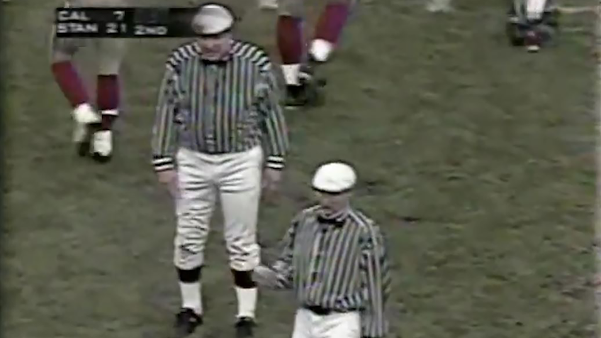
Uniform of the Day: The 100th Big Game goes back in time
THIS is how you do a throwback game.
www.2stripescpd.com
Also, another example of white helmet - dark jersey - lighter pants
Wow! These are great!

See the new Colorado State football uniforms
See photos of the new primary home and away Colorado State football uniforms, which will debut in the 2023 season.
www.coloradoan.com

For reference, in the above, Hybrid1 = Sunflower Gold + 25% Stapleton1 Gold. [The Stapleton era had two darker golds, #1 & 2, #2 being the darkest, the pants.] Hybrid2 = Sunflower Gold + 33% Stapleton1 Gold. Hybrid3 = Sunflower Gold + 50% Stapleton1 Gold.View attachment 113781
I am learning a lot from my historical Cardinal & Gold study. I would be happy with any of these 5 options, especially #2-5. More to come.
Edit: And if you're wondering, yes, I'm advocating, at the very least, to start using our official 'university gold' with the athletic uniforms.
Agree. The turf at Clyde Williams looked pretty good as well. Interesting to watch that delayed counter handoff to the halfback.Easily the best ISU uniforms ever! Not even close.
Good helmets with mascot Cy.Very true. And yet, no color pics can be found (easily) of the ISU football teams from the '50's to early to mid (even late) '60s. We take color for granted now, not so much back then, even in to the '70's and early '80's.
Even widerightnattylite couldn't find color pics in this article.
RANKED: The Top 20 Iowa State Football Jerseys
This is not a helmet ranking, or a pant ranking. It’s a ranking on the meat of a uniform sandwich, the shirt.
I will keep my eyes open but I don't have great confidence in finding anything.
