My first "knee jerk" reaction: The shape reminds me of the Texas logo and teh color reminds me of OU...
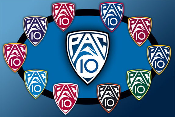
If it is anything like the BI6 or the Pac 12, there should be variations on the logo branding per team. That is one of the reasons to simplify the design...so that it can be used ubiquitously across all conference members' marketing schemes. The BI6 has a white solid/outline version that goes on the field and the primary school color version of that for their basketball courts, and the Pac-12 has a similar all-white version, and this: