Sounds like they may get yet another name change...
Report: ‘Pretty Good Chance’ Commanders Get New Team Name
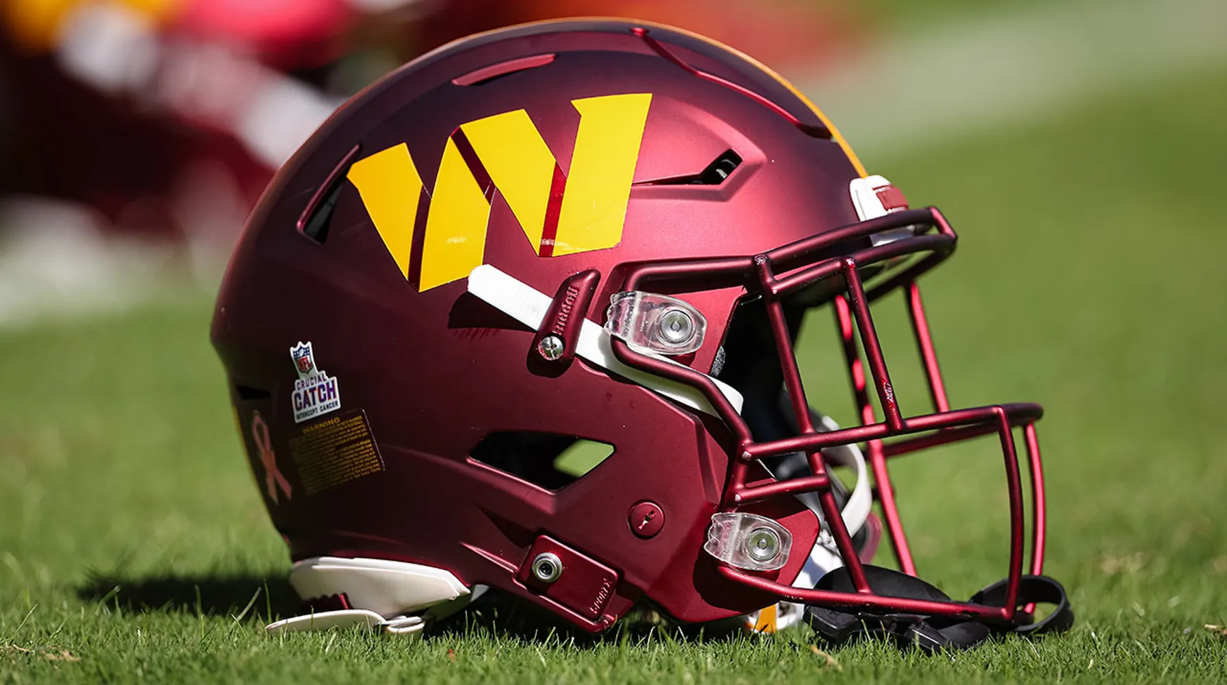
The team has already had three names since 2020.uni-watch.com
Just go with Red Hawks, use the early 70's logo and move on with life.


Follow along with the video below to see how to install our site as a web app on your home screen.
Note: This feature may not be available in some browsers.
Sounds like they may get yet another name change...
Report: ‘Pretty Good Chance’ Commanders Get New Team Name
The team has already had three names since 2020.
Kobe started with Adidas and made a pretty big splash for a couple of yearsI mean it was MJ choosing Nike over Converse 40 years ago that really made the difference. The closest Adidas has come in basketball was with Tracy McGrady. Other sports, soccer in particular, Adidas is king.

Forgot about that, I was on the TMac and AI (Reebok) train in the early 2000's.Kobe started with Adidas and made a pretty big splash for a couple of years

I think the white jersey gold pant look that we never use is a lost opportunityI never liked the McCarney Era "ketchup bottle" red/red/red combo --
View attachment 114428
I have a philosophical objection to monochrome uniforms save white/white.
They just always look bad. You're not going to convince me otherwise.
Some of the other combos from that era are actually pretty nice --
Red/White/White
View attachment 114429
Red/Red/Gold
View attachment 114430
Red/White/Gold
View attachment 114431
Red/White/Red
View attachment 114433
Heck, even the rarely-used red/red/white is okay --
View attachment 114432
I'd totally be down for an update of this that...
-- generally improves the uniform quality and materials
-- uses the more recent colors (mostly the darker red into a cardinal shade)
-- uses the more recent font for any text (though not the uniform numbers, varsity block is fine)
-- updates the logo from the bird in the blender to the I-State (unfortunate necessity)
-- sticks to C/C/G at home and rotates C/W/C, C/W/G, and C/W/W on the road
-- mix in a white helmet if you must
Too bad Campbell hates the gold and loves a non-school color.
I think the biggest reasons are mostly practical. First, the materials for football jerseys needs to be more robust and durable to withstand the stretching, pulling, and rubbing that comes in a high contact sport like football. I am also not sure if the fabrics that are used for football jerseys can even be sublimation printed.I love how soccer jerseys have sublimination printed jerseys in many colors and patterns. They are fun to browse and wear as casual shirts. The special jerseys are used for one-off games, alts, and warm ups, etc.
Teams with 150 years of history often pick random colors as their home/away/alt jerseys and very few people care. Most think they are neat to have vibrant options.
I don't know why football, especially NFL football, can't figure out having alts and special colors does not water down a "brand" at all. In fact, it's a huge opportunity to sell more merch.

As a Jets fan since 1980 (when I was 10 years old) I have to agree, I definitely have great fondness for this logo!That should be the primary Jets logo
It's also way more "Jet"sy looking - faster, more aerodynamicAs a Jets fan since 1980 (when I was 10 years old) I have to agree, I definitely have great fondness for this logo!
Illinois adding stripes to the shoulders in their new unis:


