I need one of those Ames helmet polos the players are wearing today.
Which one of these handsome fellows is our QB?
; )


Follow along with the video below to see how to install our site as a web app on your home screen.
Note: This feature may not be available in some browsers.
I need one of those Ames helmet polos the players are wearing today.
Ban Hammer!!!Tell him to go with the bugle and watch the world burn

OK. And that solves the gold conundrum. Case closed.I’m sorry but you have to be blind. The Mac jerseys literally (and factually) were off the rack generic red. We literally told Nike “take your base cheapest materials and base red color and your base yellow color”. During the “Mac Nike era” - Iowa State football had the cheapest jerseys in all of college football. Let that sink in. Off the rack, high school level quality uniforms. With generic-ass colors and screenprinted numbers. Beyond embarrassing. They made have even included the 90’s “shimmer sheen” or durasheen material! Thank GOD we finally got the “Nike elite” jerseys when we Chizik came. The cardinal was (and still is) the shade we requested. We choose the shade of “yellow” too (and no, it was never a consideration to go back to using and ‘old gold’ or ‘shiny’ gold for the pants - the intention across all sports was adopt a consistent tone of yellow across the board. And they did.). Were these uniforms perfect? No, but they were classic looking, clean, and very high quality. Nike still is the only brand that I will buy ISU polos, shirts, etc. from, as they are the only ones that get the colors (and the logo/patch) correct.
The shoulder stripes are not the problem.Ditch the stupid shoulder stripes.
That's the frustrating part, there are obviously ISU fans who are talented graphic artists you and many others on this thread are evidence of that. It would be cool if the AD would utilize that resource more.Fix the dated font - look at the A and E in particular - and yeet the bevels. Like what I showed here from one of my old stories:
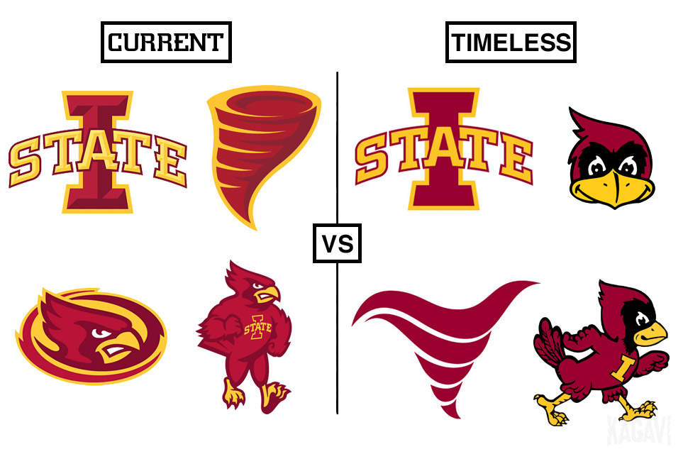
Orr-nado isn't my creation. As my stories said, it was from the mind of @amestoplease - but all I did was try to bring more attention to it. For the record, I've also seen other tornado concepts that are cool and I've suggested the AD keep iterating and trying out different tornado logos for different use cases. The bugle logo could be used as an emoji, etc. Eventually one would rise to the top IMO.
Speaking of him, I just saw this post of his:
New Walking Cy Logo Concept
Even more amazing stuff. There's something to be said for giving a talented artist (with a full understanding of ISU's cultural history) free reign over branding - rather than focus grouping it to death.
Which one of these handsome fellows is our QB?
; )
Haha! I like ANY KU uniform better than these! Get real!
NOT! Good job Cd! Way to get things back on track. Not that I mind seeing new KU unis, but comparing them to us doesn't really make sense. They are not so great.
What's it worth to ya?
Well it can be done, relatively easily, but then I'd have to..... No, wait, that's the wrong expression.
I can do it. But I will need some fun money!
Of course. Happy is good! Wouldn't it be nice if we could all be happy, all the time!If you can do that, it would be awesome! Can't give you anything for it, but just making me happy should be worth it to you, right?
The UTEP pic is not a great angle, poor lighting, very low resolution. I could do it but I'd rather spend the time, if I'm gonna do it, on a better pic to start with. I did a quick look at similar unis (Florida and Auburn) but I am having trouble finding the right pic easily.If you can do that, it would be awesome! Can't give you anything for it, but just making me happy should be worth it to you, right?
Yeah, I think you misread my post. I agree that the Mac jerseys were worse. They red and yellow was as ketchup/mustard as it gets.I’m sorry but you have to be blind. The Mac jerseys literally (and factually) were off the rack generic red. We literally told Nike “take your base cheapest materials and base red color and your base yellow color”. During the “Mac Nike era” - Iowa State football had the cheapest jerseys in all of college football. Let that sink in. Off the rack, high school level quality uniforms. With generic-ass colors and screenprinted numbers. Beyond embarrassing. They made have even included the 90’s “shimmer sheen” or durasheen material! Thank GOD we finally got the “Nike elite” jerseys when we Chizik came. The cardinal was (and still is) the shade we requested. We choose the shade of “yellow” too (and no, it was never a consideration to go back to using and ‘old gold’ or ‘shiny’ gold for the pants - the intention across all sports was adopt a consistent tone of yellow across the board. And they did.). Were these uniforms perfect? No, but they were classic looking, clean, and very high quality. Nike still is the only brand that I will buy ISU polos, shirts, etc. from, as they are the only ones that get the colors (and the logo/patch) correct.
Red/Red/Yellow and Red/White/Yellow are among the worst unis we've ever worn. Per usual, our road unis are much better because our primary colors don't mesh well without something between them.I never liked the McCarney Era "ketchup bottle" red/red/red combo --
View attachment 114428
I have a philosophical objection to monochrome uniforms save white/white.
They just always look bad. You're not going to convince me otherwise.
Some of the other combos from that era are actually pretty nice --
Red/White/White
View attachment 114429
Red/Red/Gold
View attachment 114430
Red/White/Gold
View attachment 114431
Red/White/Red
View attachment 114433
Heck, even the rarely-used red/red/white is okay --
View attachment 114432
I'd totally be down for an update of this that...
-- generally improves the uniform quality and materials
-- uses the more recent colors (mostly the darker red into a cardinal shade)
-- uses the more recent font for any text (though not the uniform numbers, varsity block is fine)
-- updates the logo from the bird in the blender to the I-State (unfortunate necessity)
-- sticks to C/C/G at home and rotates C/W/C, C/W/G, and C/W/W on the road
-- mix in a white helmet if you must
Too bad Campbell hates the gold and loves a non-school color.
Red/Red/Yellow and Red/White/Yellow are among the worst unis we've ever worn. Per usual, our road unis are much better because our primary colors don't mesh well without something between them.
I absolutely LOVE these UTEP unis... as long as they also have a blue helmet and a white helmet option too. If they do... they are perfect as far as I'm concerned. Swap out the blue for our cardinal... beautiful! Can someone do that?
If you can do that, it would be awesome! Can't give you anything for it, but just making me happy should be worth it to you, right?
The UTEP pic is not a great angle, poor lighting, very low resolution. I could do it but ...


I had thought about that too. I was thinking about putting in the outfield, a la Field of Dreams, but I thought, nope, keep it simple...Do they play football in the sand dunes?

This is for Clonedude, per request. The UTEP color change is not a bad look. I just don't think we are going to get rid of our black or white helmets. Therefore I don't believe we will be getting gold helmets, any time soon. If we did get a gold helmet, that would make 4! That's a lot of helmet cost and maintenance.
And I'm not sure I Iike the white facemask. Too Chiefs? But I enjoyed doing it. I think we can do better. And as others have said, this is very 'cookie-cutter'. I'm still working some ideas.
View attachment 114512
And I know what you mean about the c/c/g. If we had a darker gold option, it would be fine. It could at least be an occasional option, and would look good (with the right gold). We haven't had that now for about 43 years!Red/Red/Yellow and Red/White/Yellow are among the worst unis we've ever worn. Per usual, our road unis are much better because our primary colors don't mesh well without something between them.
Thank you. And please don't focus too much on some of the minor details, during this process. FYI, I used our exact and current shade of cardinal. The lighting of that pic messes things up, especially if you are looking for a precise color. You can't really see the true color in the original nor the color mod. Also, I did nothing to the gold in that pic, other than 'lightening' of it (the player) initially, before I got started with the color change. Otherwise the original pic was just so dark.Thanks a LOT for doing that! I think it has some potential…. I think the cardinal needs to be more cardinal and less red, and the gold needs to be more mustardy and less bright yellow…. it looks too Ronald McDonald for me.
But you did a great job!
This is for Clonedude, per request. The UTEP color change is not a bad look. I just don't think we are going to get rid of our black or white helmets. Therefore I don't believe we will be getting gold helmets, any time soon. If we did get a gold helmet, that would make 4! That's a lot of helmet cost and maintenance.
And I'm not sure I Iike the white facemask. Too Chiefs? But I enjoyed doing it. I think we can do better. And as others have said, this is very 'cookie-cutter'. I'm still working some ideas.
View attachment 114512

")


