

No forums found...
Site Related
Iowa State
College Sports
General - Non ISU
CF Archive
Install the app
How to install the app on iOS
Follow along with the video below to see how to install our site as a web app on your home screen.
Note: This feature may not be available in some browsers.
New Uniforms Revealed
- Thread starter CyTwins
- Start date
No forums found...
Site Related
Iowa State
College Sports
General - Non ISU
CF Archive
You are using an out of date browser. It may not display this or other websites correctly.
You should upgrade or use an alternative browser.
You should upgrade or use an alternative browser.
Gross
Um, no. And let's not look at anything OU does. Two reasons. 1) They are OU and we just don't care anymore. 2) Their history on alt unis suc, iirc.
And a 3rd reason, these are not good.
These are going to be illegible from the TV angle on Saturday. Just like our grey jerseys were in 2016.
Someone needs to have enough sack to tell these schools "no."
That uniform should have a white number. If they want red (crimson) on it, use it to outline the number.

These are going to be illegible from the TV angle on Saturday. Just like our grey jerseys were in 2016.
I actually don't think it will be too bad since the numbers are outlined in white. If they weren't you'd be right though.
I think they actually look pretty good.
Well, cool. Everybody has one.I actually don't think it will be too bad since the numbers are outlined in white. If they weren't you'd be right though.
I think they actually look pretty good.
Opinion, that is. Haha
------------------------
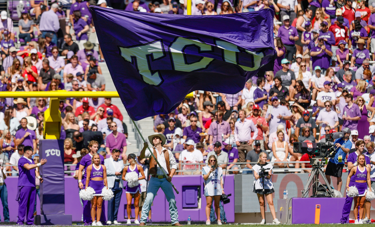
You may also like what TCU has slogged together today, vs. OkState?
At least you can see their numbers! Ha.
And on TCU's unis today, did you notice the shoulder number color is purple, the main number is red. More interesting? Not sure if I've seen that before.
------------------------
We will probably see more forward-thinking uniform design, espescially maybe in the new Big 12, from now on (not saying I liked what TCU, or OU wore today).
Of course, ISU will lag behind. That may either be good or bad.
Well, cool. Everybody has one.
Opinion, that is. Haha
------------------------
You may also like what TCU has slogged together today, vs. OkState?
At least you can see their numbers! Ha.
And on TCU's unis today, did you notice the shoulder number color is purple, the main number is red. More interesting? Not sure if I've seen that before.
------------------------
We will probably see more forward-thinking uniform design, espescially maybe in the new Big 12, from now on (not saying I liked what TCU, or OU wore today).
Of course, ISU will lag behind. That may either be good or bad.
I have to take my earlier opinion back..... the numbers were hard to read today.
I still thought they looked sweet though!
If they (OU) were bent on doing the uni they did today, they could have made it better fairly easily. 1) Use a broader white trim to the numbers, and 2) choose a 50% lighter shade of red for the numbers. They would have gotten nearly the same effect with better results.I have to take my earlier opinion back..... the numbers were hard to read today.
I still thought they looked sweet though!
Either way, I still didn't like it. But it's OU so who cares!
Anything is better than the shitsuits TCU rolled out. My word those were horrible.If they (OU) were bent on doing the uni they did today, they could have made it better fairly easily. 1) Use a broader white trim to the numbers, and 2) choose a 50% lighter shade of red for the numbers. They would have gotten nearly the same effect with better results.
Either way, I still didn't like it. But it's OU so who cares!

Liked those, did you?Anything is better than the shitsuits TCU rolled out. My word those were horrible.
LOL. Yeah I don't mind being ahead of the curve but they broke the curve there!

Agree, atrocity. Just because you "can," doesn't mean you should. This could apply to MANY alternate uniforms.Anything is better than the shitsuits TCU rolled out. My word those were horrible.
I just couldn’t figure out what they were trying to achieve, it was so much of everything. It honestly looked like they asked a fashion designer out of NYC to design a football uniform out of whatever they had sitting on the floor.Liked those, did you?
LOL. Yeah I don't mind being ahead of the curve but they broke the curve there!
It reminded me of me about 4-6 years ago, with uniform design. LOLI just couldn’t figure out what they were trying to achieve, it was so much of everything. It honestly looked like they asked a fashion designer out of NYC to design a football uniform out of whatever they had sitting on the floor.
I just couldn’t figure out what they were trying to achieve, it was so much of everything. It honestly looked like they asked a fashion designer out of NYC to design a football uniform out of whatever they had sitting on the floor.
TCU Makes Its Case For Coolest Uniforms Of 2022 With Their 'Spit Blood' Alternative Fits
The #13 TCU Horned Frogs unveiled their "spit blood" alternative uniforms for this week's huge game against #8 Oklahoma State. In a uniform reveal video
I’m pretty sure they designed them, showed them to the team and they’re like what the **** are these? Then they had to Google reasons to explain them away.TCU Makes Its Case For Coolest Uniforms Of 2022 With Their 'Spit Blood' Alternative Fits
The #13 TCU Horned Frogs unveiled their "spit blood" alternative uniforms for this week's huge game against #8 Oklahoma State. In a uniform reveal videobrobible.com
TCU Makes Its Case For Coolest Uniforms Of 2022 With Their 'Spit Blood' Alternative Fits
The #13 TCU Horned Frogs unveiled their "spit blood" alternative uniforms for this week's huge game against #8 Oklahoma State. In a uniform reveal video
OK then. That was, ah, interesting, I think.I’m pretty sure they designed them, showed them to the team and they’re like what the **** are these? Then they had to Google reasons to explain them away.
Jeremy, I like your theory!
So am I. Class of '87I was thinking the same thing. Tri-Rivers EB Buccaneer here.