

No forums found...
Site Related
Iowa State
College Sports
General - Non ISU
CF Archive
Install the app
How to install the app on iOS
Follow along with the video below to see how to install our site as a web app on your home screen.
Note: This feature may not be available in some browsers.
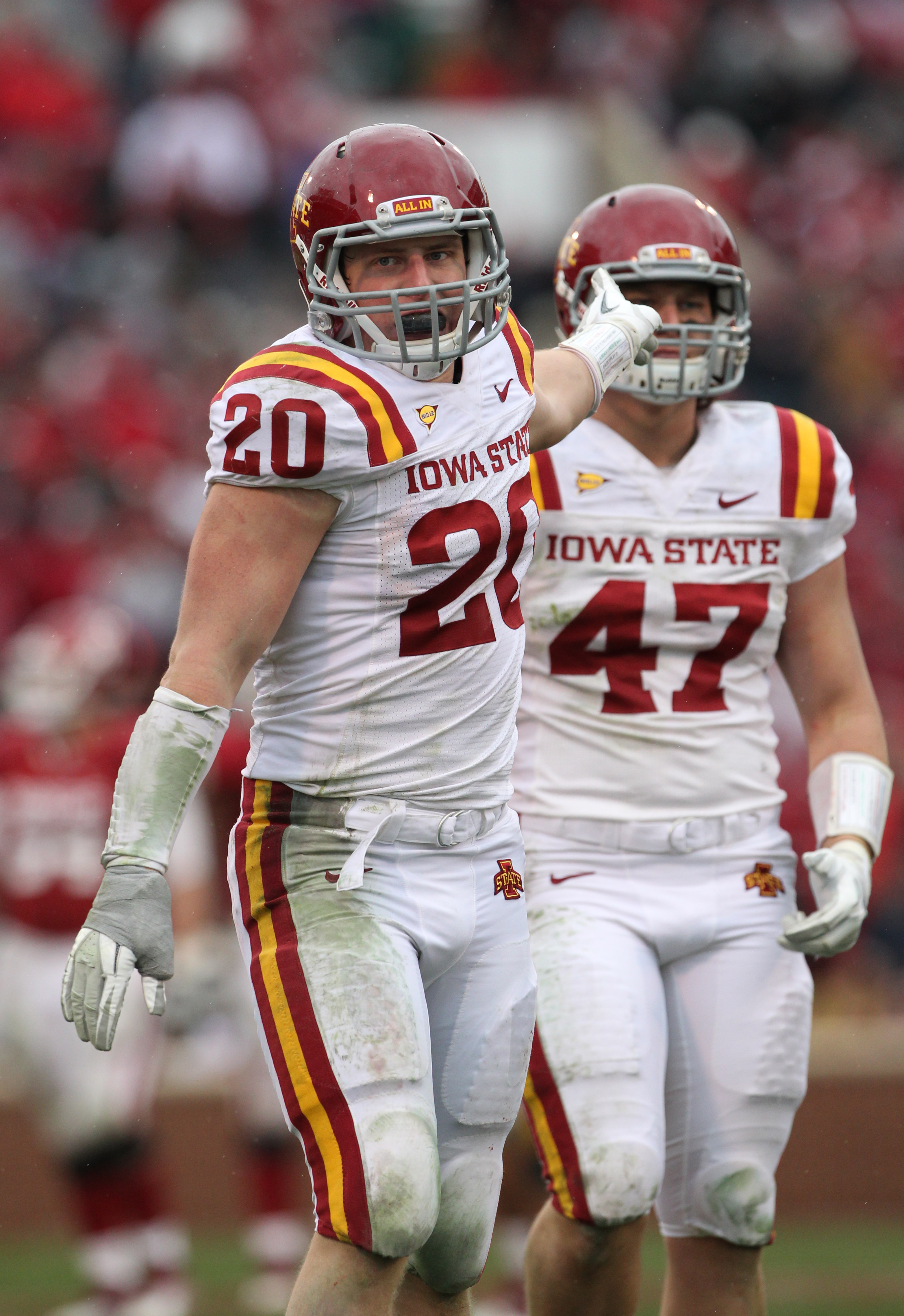
New Uniforms Revealed
- Thread starter CyTwins
- Start date
No forums found...
Site Related
Iowa State
College Sports
General - Non ISU
CF Archive
You are using an out of date browser. It may not display this or other websites correctly.
You should upgrade or use an alternative browser.
You should upgrade or use an alternative browser.

I liked it with the red reflective outlined I-State logo we used maybe just a couple of times a few years ago.

I kinda miss the stripes on the Rhoads unis, for white uniforms.
I kind of agree. I never understood the hatred for our old uniforms. Especially when we added white pants and a white helmet. They were just a good traditional clean uniform look. (the gray version was a miss)I kinda miss the stripes on the Rhoads unis, for white uniforms.
I’m actually probably younger than most of y’all, but I’ll take it. I understand the kids wanna express themselves & that’s okay with me.
I’m just a traditionalist.
I’m the type that prefers the original Seahawks uniforms rather than the costumes they're wearing now.
I really dislike BFBS & GFGS uniforms, although I can admit ISU's BFBS uniform is a great looking uniform. The Rhoads GFGS uniform was atrocious. (The gold jersey would have been great with a gold helmet & white pants.)
Tampa Bay's alarm clock uniforms were gross. Their current uniforms (based on a previous uniform design) are okay. But, I prefer the creamsicle uniforms.
I will take Alabama, Penn State & Texas's (#hornsdown) uniforms over Oregon any day, ALTHOUGH Oregon should keep doing what they're doing b/c that is what Oregon does & it would be weird if they didn't...
Disliking modern uniform designs is a little different than disliking arm bands or custom thigh pads lol.
Alabama and Texas uniforms are fine, but the Penn St jerseys are for middle schools.
Are you talking about these? I think it's much cleaner without the stripe.I kinda miss the stripes on the Rhoads unis, for white uniforms.
I kinda miss the stripes on the Rhoads unis, for white uniforms.
That's the biggest miss on our current design other than not incorporating white on the home jersey.

I kind of agree. I never understood the hatred for our old uniforms. Especially when we added white pants and a white helmet. They were just a good traditional clean uniform look. (the gray version was a miss)
The away uniforms were fine. But the home unis with the gray facemasks and smaller I-State decal were way too close to USC.
Campbell's first couple of seasons, they switched to a larger I-State decal on the helmet and changed the facemasks to cardinal. That helped a lot, but the home unis were still too close to USC. Not our worst jersey by a long shot, but we needed something new.
That's the biggest miss on our current design other than not incorporating white on the home jersey.
I think for the W-C-W home package, either a single cardinal stripe on white pants OR white numeral trimmed in gold would tie it together more effectively.
Updated w/ this week's plan (assuming there isn't a "last minute surprise")...
Iowa State uniform tracker 2021, so far, along with game result:
UNI - W-C-W … win
Iowa - W-B-W … loss
at UNLV - C-W-C … win
at Baylor - C-W-W … loss
Kansas - C-C-W … win
at Kansas State - C-W-C … win
Oklahoma State - C-C-W … win
at West Virginia - C-W-C … loss
Texas - B-B-B … Win
at Texas Tech - W-W-W … (result pending)
Right. In my half-assed search, I couldn't find a pic with the white helmet. I don't know what it is but that should pad stripe just looks dumb to me.I think this is the look he was talking about..
The matching stripes on the helmet, shoulder, and pants on the old WWW's were one of my favorite features. I wish the current set had some stripes on the helmets and pants.

I just miss having some cardinal and gold on the white pants. I’m not a fan of the only white pants. I get that it looks clean to some people but to me it just feels like it’s lacking something.I kinda miss the stripes on the Rhoads unis, for white uniforms.
edit: I don’t know if the traditional stripes would look good on the pants still but I’d love to see a little more cardinal on them beyond the I state logo and Nike swoosh
I don't disagree - I was just describing what I dislike - thigh pads with designs, arm & leg bands, mouth guards that look like pacifiers, gimmicky football "costumes"Disliking modern uniform designs is a little different than disliking arm bands or custom thigh pads lol.

Just b/c they like middle school boys doesn't mean they're uniforms are for middle schoolers...Alabama and Texas uniforms are fine, but the Penn St jerseys are for middle schools.
So you think our best offensive player looks stupid. Got it.I don't disagree - I was just describing what I dislike - thigh pads with designs, arm & leg bands, mouth guards that look like pacifiers, gimmicky football "costumes"
View attachment 91776
Just b/c they like middle school boys doesn't mean they're uniforms are for middle schoolers...
Why put words in my mouth?So you think our best offensive player looks stupid. Got it.
Ball State helmet logo tonight looks a bit like Walking Cy. Game on ESPN2.
Agreed... I wouldn't prefer it as the full-time helmet logo, but I think I would like it a lot for a one-off situation!Ball State helmet logo tonight looks a bit like Walking Cy. Game on ESPN2.
they should do
all cardinal for home day games
all black for home night games
all white for away games
imo
the combinations don't look as good
all cardinal for home day games
all black for home night games
all white for away games
imo
the combinations don't look as good