

No forums found...
Site Related
Iowa State
College Sports
General - Non ISU
CF Archive
Install the app
How to install the app on iOS
Follow along with the video below to see how to install our site as a web app on your home screen.
Note: This feature may not be available in some browsers.
New Uniforms Revealed
- Thread starter CyTwins
- Start date
No forums found...
Site Related
Iowa State
College Sports
General - Non ISU
CF Archive
You are using an out of date browser. It may not display this or other websites correctly.
You should upgrade or use an alternative browser.
You should upgrade or use an alternative browser.

I guess those could be considered throwbacks??? HahaThe ISU Football Twitter page is really pounding the "Past and Present #Homecoming" theme this week.
Any chance they sneak in throwback uniforms this week?
I still don’t understand the black collar. Bleh.
We have zero white in the shirts so it just looks dumb. Apparently we need Garanimals to help somebody coordinate better.
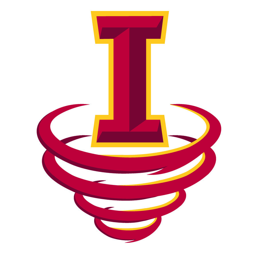
What if, and it may sound crazy, drop the lower part of the "I" into a Tornado shape? Combing the two logos in doing so.This is my favorite, Ultimate would be with the Orr Cyclone logo, but I actually love the script Cyclones logo too. These are such timeless classic looking logos.


Looks like Maryland.
I do wish ISU could stick with a 'look' and did actual alternates a few games a year instead of just 'this week's uniform'.
I do wish ISU could stick with a 'look' and did actual alternates a few games a year instead of just 'this week's uniform'.
Pretty nice, would like a little more gold in there somewhere, but I know they are working with what they have on hand.
This thread tell me our fan base is either old or not hip. Probably both.
Bumping my post from last time (vs Akron) we wore the cardinal top and white pants. It looks cool-ish but it just doesn’t tie together.The Chiefs jerseys work so well because the strip on the sleeve matches the pants (and socks). It is the definition of uniform.
What we did vs Akron was the opposite. Nothing really worked together. The jersey needs some sort of accent that the pants can follow so everything flows.
Holy god, we love complaining about uniforms, lol.
Looks like Maryland.
I do wish ISU could stick with a 'look' and did actual alternates a few games a year instead of just 'this week's uniform'.
Grrrr...get off my lawn!
yeah the black collar on this combo just doesn't go at all. the combo looks good but the black doesn't.
Something like Kagavi has done like this?What if, and it may sound crazy, drop the lower part of the "I" into a Tornado shape? Combing the two logos in doing so.


The bit of black on the neck roll is annoying.
Otherwise a solid pick given what happened last time.
Otherwise a solid pick given what happened last time.
At least it’s not navy?The bit of black on the neck roll is annoying.
Otherwise a solid pick given what happened last time.
The red uniforms are cheap looking.
At least it’s not navy?
The red uniforms are cheap looking, but we’ll have new ones in a few years.
The whole set is just under-designed. I cannot believe that is the case given I was so sure they would be overly busy and trendy, but it turned out the opposite. They look like a generic high school template. The numbers are not obvious or distinct enough to really make up for a very bland experience through the rest of the uniform.
Some gold elements would really help.
The white jersey is really nice, though...

...but our old white jerseys were really nice, too...

Seems to be a trend.
I just think we have eliminated gold in our color scheme too much. I also think we should start moving towards a true gold, but our own shade, not the tan gold of other schools but the true yellow gold, like we had in the Jack trice throw backs, or even better like is in the current metallic I State logo. If we switched to that metallic true gold in everything and brought it out more it would be completely unique, and look awesome. I also still believe the extra bevels in the I state logo are too busy, and the Orr Cyclone is a classic logo, So with that said I still say the uniforms I posted before and will post here with these updated logos, both the classic Orr cyclone which is timeless and would and could stand the test of time like other logos, and the I-state without the bevels looks the best as well as the outline one we currently use. We need a Cyclone logo, a mascot logo, and a word mark logo. So versions of the ones below with true metallic yellow gold, and classic logos are what really think we need to move towards. Although I don't have a vote in the decisions. And just to note, none of the following designs are mine, I have just saved them and share them.


This was one of my favorites this past offseason.