

New Big 12 logo

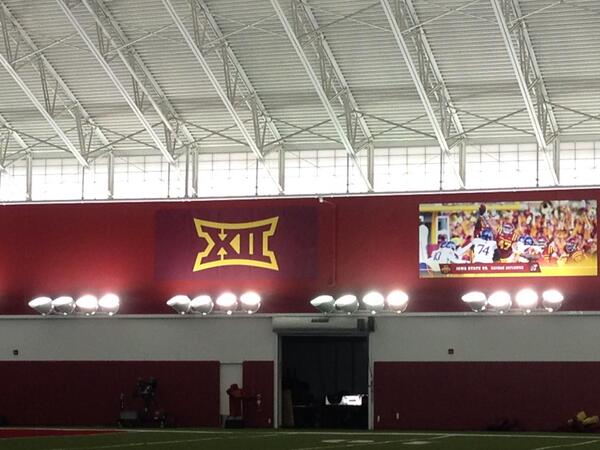
Seems like the new logo is getting pasted all over Campus (soccer fields, Bergstrom, Lied)...any chance we finally see it back on the football field and basketball court these coming seasons?
Bp27eSkCMAAfPBi.jpg


BpIu3LMIMAAEVt5.jpg:large

Can't they get the colors right or at least consistent? That top one is maroon and gold, and the bottom one is bright red and yellow. The first one looks especially ghetto with the maroon rectangle pressed on a cardinal wall.
 
It will be on the field and bball court this year, there are very specific rules about placement for each sport...I believe we are now required to have it at the location the Big 12 determined for each sport.
 
Can't they get the colors right or at least consistent? That top one is maroon and gold, and the bottom one is bright red and yellow. The first one looks especially ghetto with the maroon rectangle pressed on a cardinal wall.

It's often literally impossible to create different materials that photograph the same color. Even if you nail the color exactly, they won't photograph the same color…even with the same camera and the same lighting.

I'm an art director and I'll often see a photo shoot where say nylon clothes and rubber or synthetic boots match exactly perfect but in the photo they'll appear different colors on the same model (sometimes drastically different) and need to be photoshopped. In case you can't tell it's a never-ending love/hate obsession for me…you just have to accept that sans-photoshop things aren't going to ever match perfectly in photos and video, especially if they're different materials. The best way to hide it is often to not try to match things near each other…have that banner on a red wall be a white banner instead of attempting the match the red exactly. And I haven't even gotten into when I approve a production sample color and then the final production run doesn't match the sample color.
 
West Virginia outfitted their facilities with the new logo this past week, @GamedayWVU has been posting a lot of photos. The WVU application looks pretty good IMO.
 
Can't they get the colors right or at least consistent? That top one is maroon and gold, and the bottom one is bright red and yellow. The first one looks especially ghetto with the maroon rectangle pressed on a cardinal wall.

Or it could have something to do with lighting...
 
I knew we hadn't put it in Hilton yet because they didn't wanna put one in after we had to replace the court but it bugged the living crap out of me not having it on the football field.
 
It's often literally impossible to create different materials that photograph the same color. Even if you nail the color exactly, they won't photograph the same color…even with the same camera and the same lighting.

I'm an art director and I'll often see a photo shoot where say nylon clothes and rubber or synthetic boots match exactly perfect but in the photo they'll appear different colors on the same model (sometimes drastically different) and need to be photoshopped. In case you can't tell it's a never-ending love/hate obsession for me…you just have to accept that sans-photoshop things aren't going to ever match perfectly in photos and video, especially if they're different materials. The best way to hide it is often to not try to match things near each other…have that banner on a red wall be a white banner instead of attempting the match the red exactly. And I haven't even gotten into when I approve a production sample color and then the final production run doesn't match the sample color.

I'm no expert, but I seem to notice this with purple. The Vikings always look like they have three shades of purple working and the old Lakers teams short/tank combo always seemed way off in photos.

Do certain colors have the matching issue more than others or are the Vikings just a sub par organization?
 
I'm no expert, but I seem to notice this with purple. The Vikings always look like they have three shades of purple working and the old Lakers teams short/tank combo always seemed way off in photos.

Do certain colors have the matching issue more than others or are the Vikings just a sub par organization?

Purple is perhaps the hardest color to print consistently with process printing, hard to keep it bright when created by mixing process inks. If you're talking about solid paints, dies, and plastics it's not much different, but everything is a challenge. The helmet/jersey thing ISU and other teams always seem to have, I think is in large part just different materials photographing differently, the solid shiny helmet is affected differently by light than the softer and slightly porous polyester/nylon jersey.
 
Last edited:
the new logo isn't effective until the upcoming academic year. no one had it last season.

I know, which is why I was alright without having a logo on the basketball court till next year since they weren't gonna put it on for a year then change it. It just bugged me that we didn't put the logo on the football field.
 
I know, which is why I was alright without having a logo on the basketball court till next year since they weren't gonna put it on for a year then change it. It just bugged me that we didn't put the logo on the football field.

Does anyone know if we are actually putting a Big 12 logo on the football field this year?
 
Purple is perhaps the hardest color to print consistently with process printing, hard to keep it bright when created by mixing process inks. If you're talking about solid paints, dies, and plastics it's not much different, but everything is a challenge. The helmet/jersey thing ISU and other teams always seem to have, I think is in large part just different materials photographing differently, the solid shiny helmet is affected differently by light than the softer and slightly porous polyester/nylon jersey.

To add a little to the previous post, Inks and dyes and colors are metameric...they change value (Look) depending on light source. Some colors are easier match than others. Then you have an issue of reflectively and different substrate plus the lighting...logo on BB floor VS nylon jersey or wool ISU sweater in the stands or banner in the dark rafters. The issue is a real pain when dealing with corporate color reproduction. In printing, I say go PMS colors and limit the issues.

As well, your wife or you probably has dealt with the same issue by buying a black pair of shoes or sport coat for an outfit at home. Get home and the shoes don't match and the jacket is ugly...different lighting being the biggest culprit. Paint swatches at Lowes look different than in a hallway at home. So trying to get the paint guy for the logos on the field to work with Nike (Uni's) for color match...then in what light situation...not going to happen. There is a lot I don't know or understand, however, nature of color... It is not that easy to control with so many vendors and products and environments...
 
Last edited:
some don't love this now...but look back in even five years...the previous logo isn't timeless or impactful at all. Much needed, worst to first among major conferences except possibly SEC which is simple, impactful and very timeless.
 
They seem to be focused on a younger demographic. Not sure that this does it. Or what is accomplished by a younger demographic "liking" the conference logo.

Also, wondered why they used the red trim (such as on the cover of their style manual). Seems like a silver or black trim would have more neutral, given that several of the schools use red as a team color. Good for us that we are one of them.

At first, I didn't get the "One True Champion" tag-line, but I assume it refers to the round-robin conference play in football. Unfortunately, there can be more than "one true champion" in other sports, such as MBB which we shared with another school last year.
 
They seem to be focused on a younger demographic. Not sure that this does it. Or what is accomplished by a younger demographic "liking" the conference logo.

Also, wondered why they used the red trim (such as on the cover of their style manual). Seems like a silver or black trim would have more neutral, given that several of the schools use red as a team color. Good for us that we are one of them.

At first, I didn't get the "One True Champion" tag-line, but I assume it refers to the round-robin conference play in football. Unfortunately, there can be more than "one true champion" in other sports, such as MBB which we shared with another school last year.

Ku was league champion last year. ISU won the post season tournament.
 

Help Support Us

Become a patron