Looks like he's got a beer belly. Do'nt like it.
I like this one, but the other ones of just his noggin look pretty similar to, oh, say, Louisville...


No forums found...
Site Related
Iowa State
College Sports
General - Non ISU
CF Archive
Install the app
How to install the app on iOS
Follow along with the video below to see how to install our site as a web app on your home screen.
Note: This feature may not be available in some browsers.
Cy logo
- Thread starter Icky_Mettle
- Start date
No forums found...
Site Related
Iowa State
College Sports
General - Non ISU
CF Archive
You are using an out of date browser. It may not display this or other websites correctly.
You should upgrade or use an alternative browser.
You should upgrade or use an alternative browser.
Looks like he's got a beer belly. Do'nt like it.
When you have a tool like Cy's, you have to build a shed over it.
New Cy is cool. The tornado bird is one of the lamest logos ever made. Our best (most versatile, most marketable) was the '80's tornado.
The logo and mascot topics gather a lot of differing opinions.
The typical reactions of a marketing firm to too many opinions is to do an afternoon's work in which they simply mimic someone else and shove it down your throat as a "best alternative". They collect their half million $ and go on to the next sucker.
Instead of spending hundreds of thousands of dollars on designs the majority of donors do not like and have to be forced to purchase, why don't we tap our own resources - the students, faculty and alumnus to come up with better ideas?
But instead of establishing our own traditions, we will continue to be the I(llinois?)-State Louisville Cardinal Cyclones.
We had our own distinct helmet design once. We had decades of the Walking Cy. We've thrown them away to look like Louisville and Southern Miss. If we want to be a BCS school, and behave like a BCS school, maybe we should ignore the BS from marketing people and start behaving like we can establish our own traditions.


Yeah, I know, I'm dreaming.
I'd love to see takes of these with "I-State". I love the Tornado logo. All time favorite ISU mark.
Would have been fine with sticking with the Cy logo based off the mascot - at least it looks like our mascot.
Looks like he's got a beer belly. Do'nt like it.
Looks like he's taking a lunch time power walk in a vain attempt to shed the beer belly. That and it looks like a 3rd grader's attempt at making a Cy logo. If we had to go back to a "marching Cy" logo I would have rather gone back to the 80s menacing version (as shown in the previous post).
Anyone know where I can buy a shirt w a big logo of this on the front?
I hate to say it, but the facial expressions of the new Cy logo look a lot like.....
.............Herky. (Yuk)

.............Herky. (Yuk)
I like the old tornado, like they had in the Criner years, only thing from that era worth keeping. I don't care for the new Cy, looks cheap and half assed...but that is pretty much the norm from our athletic department. That said, I could care less about the stupid logo or what Cy is used. I like the I State thing though.
We do complain a lot. What color of shoes should the football team where? Listen, market forces will tell if this was a good move or not. If people just won't buy it, it won't last. If they do then you have to do what I did for 15 years of taz cy...accept that your opinion is in the minority.
We do complain a lot. What color of shoes should the football team where? Listen, market forces will tell if this was a good move or not. If people just won't buy it, it won't last. If they do then you have to do what I did for 15 years of taz cy...accept that your opinion is in the minority.
Which will be guided by winning. My barber is a big hawk fan going all the way back. He told me that when they started using the tiger hawk he called it the crazy chicken and that it was terrible. Well, HF's success has made the use of it a brilliant move.
We could use a picture of Foghorn Leghorn riding a tornado as our logo and if we went to a few Orange Bowls it would stick.
Anyone know where I can buy a shirt w a big logo of this on the front?
I bought one at the HyVee Pharmacy on Main Street in Ames. Idon't know if they are still in stock.
The new walking Cy is just awful and completely unoriginal. I guess I just don't understand why we have to be introducing new crappy logos every 3-4 years...
I agree, and it looks suspicously like the walking Badger - and since both Pollard and Malchow came from Wisconsin.....hmmmm.
I might have missed this, but when/why/where did this Cy logo from?
Athletics Identity Marks : Trademark Licensing Office
This was unveiled to university employees today. I hadn't seen this thread so I had no idea it was coming.
First off, I liked the new/old punching Cy, minus the hideous blue accents and weird looking nameplate from the 1990s. I was on board with the new primary "I-State" logo but the updated punching Cy made a nice secondary mark.
But if you're going to update the secondary mark, WHY NOT DO IT AT THE SAME TIME YOU'RE UPDATING THE PRIMARY MARK?
This frustrates me to no end. Since the new I-State logos were unveiled three years ago, I've bought quite a bit of new stuff in large part to replace the outdated designs of my old stuff. A lot of this new stuff featured the new punching Cy. So now my new stuff is already outdated!
Not to mention the nice new set of cornhole boards I just finished, one of which featured a giant version of the updated punching Cy.
Hey, it's been three years...aren't we due for a color change?

Remember this thing that came out as a secondary mark? Yeah, I didn't think so.
Ohio State came out with something like that (reference below)...it seemed like a cartooning trend that was geared/derived with the purpose to market to children. In that sense it could stand on its own as a supplement. I'm ok with that, but you don't see these schools making that one of the primary marks.

The "new" logo could serve the same, but it can never (and should never) replace the last updated mark.
Looks like:
and...
Looks like:

and...
now we look like fools for paying money for someone to design such a heavy handed and clunky iteration.
I agree, and it looks suspicously like the walking Badger - and since both Pollard and Malchow came from Wisconsin.....hmmmm.
I completely agree with everything Jarrods says in his post. In fact, what was once argued by JP as "establishing our own identity" has turned into "how many schools can we rip off in the process?"
I mean, (arguably) ISU's color scheme is just a rip-off of USC's (yeah, I'm not adherent to this argument, I get it hearkens back to our traditional colors, but the argument is made).
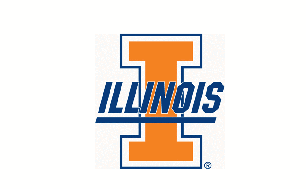
ISU's primary logo just appears to be a "combination" rip-off of Illinois' and Texas Tech's logos:
(I'm not saying I don't like the I-State logo - it's grown on me a lot, and as of now it's about the only "purchasable" merchandising logo they now have).
And now we have the Wisconsin and Missouri rip-offs.
If we just HAD to have a new Cy logo, I don't understand why we didn't go with the first one in Jarrod's post - at least that LOOKS like Cy.
I love a LOT of the things JP has done with ISU Athletics. But when it comes to ISU's Athletic Identity, some things are great (original colors and Cyclone font), some things are good (primary logo), and some things are less than desirable (the new Cy logos and having to change things every 3-4 years)
Here's an idea I can get on board with.We could use a picture of Foghorn Leghorn riding a tornado as our logo and if we went to a few Orange Bowls it would stick.


I loved the I-State logo when it came out. I am neutral on the new cy logo. Is 1000% better than that stupid swirling CY from 1995. I hated that when it came out and I really hated it as the years went by. Anything to permanently retire that piece of crap is good by me.
It makes sense to have a cy logo as well as a I-STate logo.
It makes sense to have a cy logo as well as a I-STate logo.
To summarize, nobody is happy with the new logo. Not only that but they hired a company from Pennsylvania to do the work rather then tap the resources at the university. Now that there is a backlash it's too late to do anything, they already used valuable resources to make the change.
Genius.
Genius.