2 Interesting FB tidbits

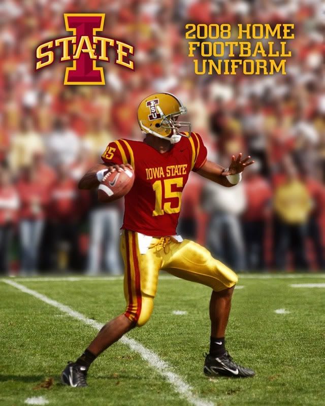
If they keep the double stripe on the shoulder, I think its more of a return to our 70's uni than a copy of USC.

exactly. These are almost IDENTICAL to the ones we wore in 77-79. If anything USC copied us. How is returning to our roots and one of the best periods of ISU football ever considered copying! Coincidence, maybe. But come on, we wore these duds 30 years ago.
 
22: Thanks for posting - those look awesome. I'm from the Earl Bruce era; didn't those unis vs Iowa this year look great?

BTW: In the 1977 game vs Iowa - the first game that resumed the series after the hiatus in 1934 (I think), we came out in the infamous "Beat Iowa" across the front of our jerseys. I must be the only one who thought that was so cool; most 'Clones just thought it psyched up Iowa and propelled them to the 12-10 victory, despite the fact that we returned most of our 2nd in the nation offense from '76. IMO, Bruce relied too much on Dexter Green (that and the fact that our starting QB was hurt before the season started, then the back-up QB got hurt, so we had to start freshman John Quinn). Iowa started a freshman QB - the coach's son, Bob Cummings Jr. We missed a 43-yd FG early in the 4th Q and no team ever threatened a score. I've been psychologically damaged ever since:mask:

well, like I have posted on the Iowa board, how cool they were hinged on the outcome. Lose the game and it looks foolish. Win it and they become legendary. Too bad it went the wrong way.
 
My uniform complaint is that I think they should have added a little white. Not much, but just outlining the numbers on the jersey and in between the two stripes on the pants and shoulder (on the home jersey). I really like the away unis, but the home just looks too much like USC. Just a few touches of white would change that.
 
My uniform complaint is that I think they should have added a little white. Not much, but just outlining the numbers on the jersey and in between the two stripes on the pants and shoulder (on the home jersey). I really like the away unis, but the home just looks too much like USC. Just a few touches of white would change that.

so stop thinking it looks so much like usc and start thinking it looks so much like 1977. They are nearly IDENTICAL!!!
 
I think copying USCs uniforms is Bush League. We could at least have the capacity to come up with our own.

We are going back to ISU's colors of the 70s, 80s and early 90s. Here is a picture that Wesley_W took of the 1982 team, which is followed by a picture of our new 2008 uniform. If we are guilty of anything, we are copying ourselves.


f00163_1024x768.jpg


ZVCFVSUFJFTKSBP.20070926163213.jpg
 
We are going back to ISU's colors of the 70s, 80s and early 90s. Here is a picture that Wesley_W took of the 1982 team, which is followed by a picture of our new 2008 uniform. If we are guilty of anything, we are copying ourselves.


f00163_1024x768.jpg


ZVCFVSUFJFTKSBP.20070926163213.jpg

does anyone have photos of the 83, 84, and, 85 uniforms. I am working on a project.
 
Uniforms - They are better than what we did have and best of all - BLUE IS TOTALLY GONE!!! WOOT! Cardinal and Gold Forever! Hopefully we'll play like USC instead of just looking like them...
 
Still think that Cardinal I on the Cardinal helmet is going to be tough to read. I still like the idea of big block lettered ISU. Other than that I love the new look.
yeah too bad no one thought about that when they were all crying "keep the cardinal helmets" i was pro white helmets all the way...the logo looks amazing on white background
 
supposedly the gold helmets looked awesome, not sure why they didn't go with them, but don't be surprised to see them within the next couple years.
 
The reason why they didn't go with the gold helmets is because JP is trying to emphasize the "State" in the logo, not necessarily the "I." Of course, the solution to that would be to switch around the colors in the logo, but if you read the new visual identity pdf found on cyclones.com that's not going to happen. And as for the "let's add white to the mix" issue - just as our colors are not cardinal, gold, and blue, neither are our colors cardinal, gold and white. Yeah, the whole argument that "white can be used as trim," well, so can blue, and that was unacceptable. Personally, I'm extremely happy that the only shred of white that will be used is for the road jersey and that's it. If the colors are cardinal and gold, keep it cardinal and gold. That's it.
 

Help Support Us

Become a patron