I mean, we have one of the worst logos in the nation. Difficult to make a good helmet.Soonerswire not a big fan of our helmets. Especially the Cardinal one. Also no homerism with the #1 pick either.

Ranking all 14 Big 12 helmets from worst to first ahead of the 2023 season
The start of the 2023 college football season is right around the corner. There's no greater feeling than watching your team don their uniforms for the first time of the season. It's the time when every fan base has at least a sliver of hope and is looking through…soonerswire.usatoday.com


No forums found...
Site Related
Iowa State
College Sports
General - Non ISU
CF Archive
Install the app
How to install the app on iOS
Follow along with the video below to see how to install our site as a web app on your home screen.
Note: This feature may not be available in some browsers.
New Uniforms Revealed
- Thread starter CyTwins
- Start date
No forums found...
Site Related
Iowa State
College Sports
General - Non ISU
CF Archive
You are using an out of date browser. It may not display this or other websites correctly.
You should upgrade or use an alternative browser.
You should upgrade or use an alternative browser.


I don't know why I read that whole thing ... but I did.
Texas should easily be #1 by far... you can tell this guy is a Sooner lover.
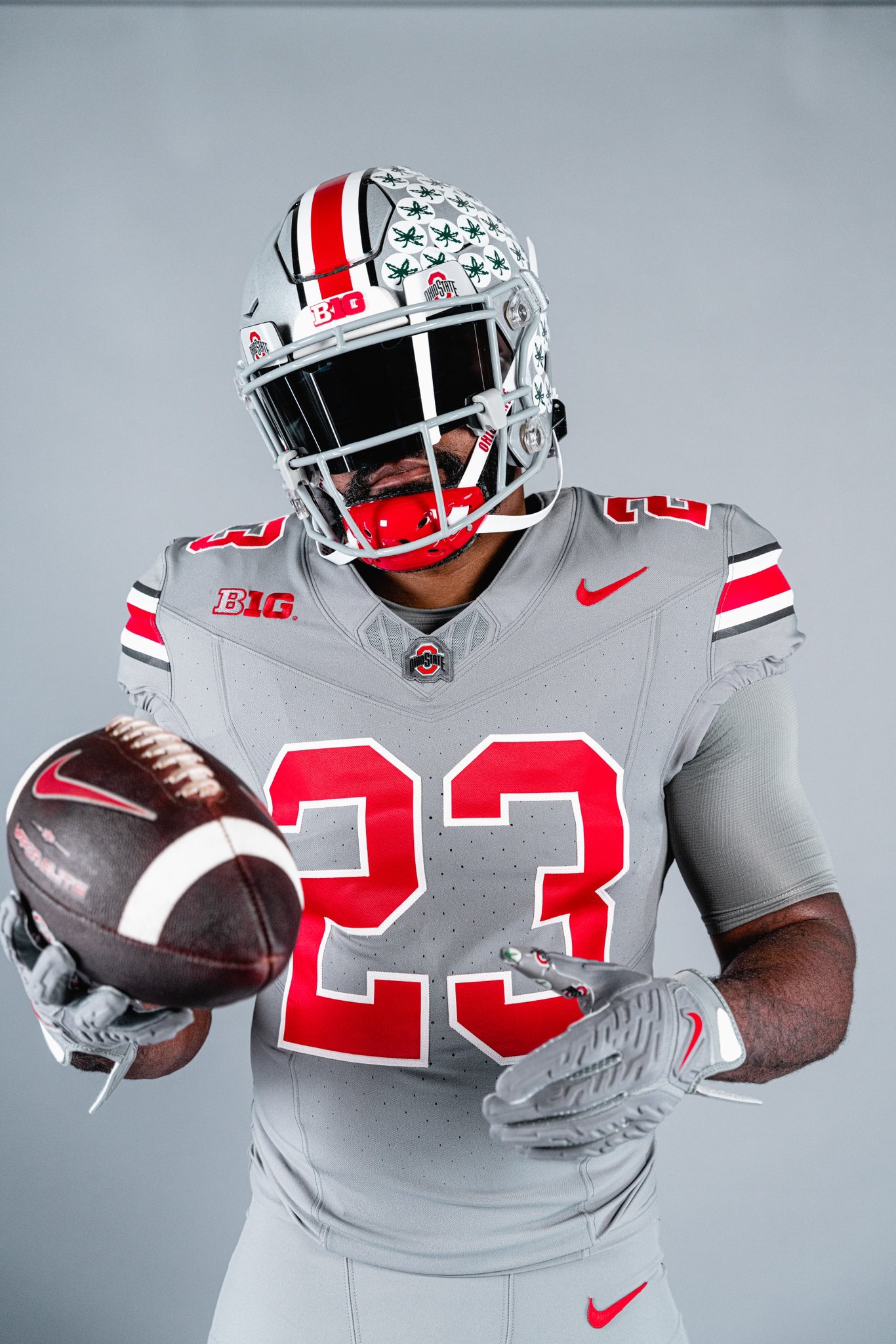
These images give us a good look at the quality & construction of our new JT jerseys vs Nike's new Vapor Fuse jersey

I mean, we have one of the worst logos in the nation. Difficult to make a good helmet.
What a stupid ******* article. Can't believe I actually clicked on it.
Baylor's BU and Houston's UH are boring and lame, but OU is ******* awesome! Makes perfect sense.Soonerswire not a big fan of our helmets. Especially the Cardinal one. Also no homerism with the #1 pick either.
Ranking all 14 Big 12 helmets from worst to first ahead of the 2023 season
The start of the 2023 college football season is right around the corner. There's no greater feeling than watching your team don their uniforms for the first time of the season. It's the time when every fan base has at least a sliver of hope and is looking through…soonerswire.usatoday.com
Soonerswire not a big fan of our helmets. Especially the Cardinal one. Also no homerism with the #1 pick either.
Ranking all 14 Big 12 helmets from worst to first ahead of the 2023 season
The start of the 2023 college football season is right around the corner. There's no greater feeling than watching your team don their uniforms for the first time of the season. It's the time when every fan base has at least a sliver of hope and is looking through…soonerswire.usatoday.com
No. That is your opinion. The I-State is a great logo and it has served us well. It will continue to do so. If you can't see that, and call it one of the worst in the nation, that's just a huge negative stretch.I mean, we have one of the worst logos in the nation. Difficult to make a good helmet.
It's a totally different story wanting some occasional retro logos, or an actual tornado type logo (like we already had), or the script CYCLONE, (like we already had). I can understand that! That's what many of us would like.
Edit: And I can understand not liking our I-State logo, some don't. I like it. And it's just nowhere near one of the worst in the nation!
I'm wondering why we even consider OU's opinion anymore? Traitors. As Our AD Jamie would say, "Can't happen soon enough!", them being gone.Baylor's BU and Houston's UH are boring and lame, but OU is ******* awesome! Makes perfect sense.
I will reserve judgement on our new matte black helmets. They may look great, we'll see. I prefer gloss helmets. I don't like matte lids usually.
And it's interesting also, that the OU dude who wrote this, says he likes our matte black helmet, then rates it 13 of 14, while rating OU's and TT's gloss helmets #1 and 2. Sounds about right.
OU, #1 is over. Get used to being #4, 5, or 6 in the SEC!
Nah.I mean, we have one of the worst logos in the nation. Difficult to make a good helmet.


In all fairness, Pitt has a new logo/identity now
Not sure why you put Boise on there - that bronco is fierce!
")
Pitt and Maryland don't use that logos anymore. Also the beaver and trident are okay, but at least they are unique. Yeah Rutgers is boring, but it fits in with all of the other block letters in the Big 10.
You forgot to include the very dated and lame Tigerhawk logo from the TOE.


Thank you for showing this comparison.These images give us a good look at the quality & construction of our new JT jerseys vs Nike's new Vapor Fuse jersey
I still believe the quality of the throwback is really good, definitely higher quality than our previous throwbacks (including the embarrassing screen-printed numbers in 07). I would not have expected that our 1-time use JT jerseys would receive the Nike Vapor Fuse treatment. Should they become our permanent uni (which I assume would never happen), then and only then would that even be considered.
But damn, those OSU unis are sharp!
**** Iowa. But they have a decent logo.You forgot to include the very dated and lame Tigerhawk logo from the TOE.
Kansas's silly Jayhawk logo gets honorable mention. They should stick with these helmets:

Last edited:
I share the previous poster's opinion - the I-State logo is not great. I get it, I understand why it was created and why it serves as our primary mark, but it isn't special. It's boring, it's fine, it's whatever. That is the best 'description' it should get. The "beveled" version of I-State is flat out bad. It looks bad in all applications. There's absolutely no justifiable modern design concept that warrants its use anymore. Bevels are only acceptable using Microsoft Word Art '97. Flat I-state and stencil I-State are lightyears better than beveled I-State.
The Cy-head-in-a-hurricane is embarrassingly bad. It's a Walmart-ass cheap looking logo. I cringe whenever it is used.
The Bugle is the single most embarrassing logo we've ever had. I am flat out embarrassed when I see it used.
The bulky-walking-Cy mascot logo is also beyond bad. I see it is used on the Iowa State beer can - what a horrible, cringy decision. I seriously cannot believe that was allowed to happen.
All 3 of these are SO cheap looking. They are Walmart quality. They are high school level logos. Like a high school sophomore who has Photoshop one a design contest at a school logo competition. That bad. It does not matter that other schools also have cheap looking logos and also have word marks and primary marks that use bevels. We, Iowa State, have existing awesome logos in our back pocket. Freaking use them.
Use Walking Cy. It needs to be the primary mascot logo.
Use Orrnado. It needs to be the primary secondary logo.
Thank God the basketball team is using some throwback logos, I hope to God they get that Basketball Cy on a uniform somehow.
Agree with all that. I think the block I-STATE logo is great when it isn't beveled.I share the previous poster's opinion - the I-State logo is not great. I get it, I understand why it was created and why it serves as our primary mark, but it isn't special. It's boring, it's fine, it's whatever. That is the best 'description' it should get. The "beveled" version of I-State is flat out bad. It looks bad in all applications. There's absolutely no justifiable modern design concept that warrants its use anymore. Bevels are only acceptable using Microsoft Word Art '97. Flat I-state and stencil I-State are lightyears better than beveled I-State.
The Cy-head-in-a-hurricane is embarrassingly bad. It's a Walmart-ass cheap looking logo. I cringe whenever it is used.
The Bugle is the single most embarrassing logo we've ever had. I am flat out embarrassed when I see it used.
The bulky-walking-Cy mascot logo is also beyond bad. I see it is used on the Iowa State beer can - what a horrible, cringy decision. I seriously cannot believe that was allowed to happen.
All 3 of these are SO cheap looking. They are Walmart quality. They are high school level logos. Like a high school sophomore who has Photoshop one a design contest at a school logo competition. That bad. It does not matter that other schools also have cheap looking logos and also have word marks and primary marks that use bevels. We, Iowa State, have existing awesome logos in our back pocket. Freaking use them.
Use Walking Cy. It needs to be the primary mascot logo.
Use Orrnado. It needs to be the primary secondary logo.
Thank God the basketball team is using some throwback logos, I hope to God they get that Basketball Cy on a uniform somehow.


Sorry some of the colors don't match, but these are my favorites.
All are good. Script Cyclones needs to be in there as well. Beveled I State Logo sucks but those two colored are fine. Use it like Iowa uses their "I" at times otherwise use the Orrnado.Agree with all that. I think the block I-STATE logo is great when it isn't beveled.
View attachment 115632View attachment 115635View attachment 115631
View attachment 115633View attachment 115634
Sorry some of the colors don't match, but these are my favorites.
Another team adding a black helmet:
More royalties headed to Iowa for their ownership of the color black.

Ran out of room. More bad/boring:
View attachment 115624View attachment 115628View attachment 115629View attachment 115626View attachment 115627
UAB needs a rebrand BADLY.
UTSA roadrunner itself is cool, without the lettering portion.
Agree. **** Iowa. Their logo does suck. Their old one pre- Fry was better.**** Iowa. But they have a decent logo.
Kansas's silly Jayhawk logo gets honorable mention. They should stick with these helmets:
View attachment 115630