I want throwbacks that we wear that have the old stripes. Our look right now is pretty clean but I do think it could be tweaked with maybe some sort of design on the pants?More and more going with the shoulder stripe look. Overall though I do usually like the more traditional, cleaner look.


No forums found...
Site Related
Iowa State
College Sports
General - Non ISU
CF Archive
Install the app
How to install the app on iOS
Follow along with the video below to see how to install our site as a web app on your home screen.
Note: This feature may not be available in some browsers.
New Uniforms Revealed
- Thread starter CyTwins
- Start date
No forums found...
Site Related
Iowa State
College Sports
General - Non ISU
CF Archive
You are using an out of date browser. It may not display this or other websites correctly.
You should upgrade or use an alternative browser.
You should upgrade or use an alternative browser.
LOL, evidently the Nike sweatshops cannot handle more than one FB uni template given the reveal of the OKSt, KU and UTEP unis which are all the same.More and more going with the shoulder stripe look. Overall though I do usually like the more traditional, cleaner look.
UTEP and Kansas are Adidas schools.LOL, evidently the Nike sweatshops cannot handle more than one FB uni template given the reveal of the OKSt, KU and UTEP unis which are all the same.
Shoulder stripes are just the 'in' thing right now. It's always cyclical.


Yikes, forgot that KU is adidas. Saw the shoulder stripes on both UTEP and KU and correlated both with OKSt's new unis.UTEP and Kansas are Adidas schools.
Shoulder stripes are just the 'in' thing right now. It's always cyclical.
Wow, unis are getting cookie-cutter really fast! At least they're going traditional
Expect ISU to jump on this trend in approx 2040 when the next uniform trend is starting. Hate how we’re always behind the curve. We stuck with the McDonald’s CPR/Chizek jerseys for about 8 years too long
KidSilverhair
Well-Known Member
I wish they’d still wear the regular team unis for the All Star Game. I always thought it was cool to see a bunch of different uniforms out on the field. Getting these special (ugly) ASG uniforms is just a way to sell more merch.Not football but Good Lord are those National League uniforms UGLY.
Bucs unveiled their Creamsicle uniform:
View Photos of Bucs in Creamsicle Uniforms
www.buccaneers.com
They appear to be a little more orange-ish than the heavily filtered photos on the Bucs website
Rhoads weren't that bad. It was a step in the right direction, but we never get font styles right. I don't know why we've been going with the huge numbers since Rhoads and now the current unis.Expect ISU to jump on this trend in approx 2040 when the next uniform trend is starting. Hate how we’re always behind the curve. We stuck with the McDonald’s CPR/Chizek jerseys for about 8 years too long
The Chizik jerseys were maybe the worst we've ever worn.
The CPR/Chizik ones are the same, no? Revealed during chiz’s tenure. That terrible USC ripoff McDonald’s look. Absolutely hated it. CPR added a few wrinkles but it was the same terrible lookRhoads weren't that bad. It was a step in the right direction, but we never get font styles right. I don't know why we've been going with the huge numbers since Rhoads and now the current unis.
The Chizik jerseys were maybe the worst we've ever worn.
The CPR/Chizik ones are the same, no? Revealed during chiz’s tenure. That terrible USC ripoff McDonald’s look. Absolutely hated it. CPR added a few wrinkles but it was the same terrible look
Year 1 with Gene was the Mac leftovers, but occasionally with yellow pants.
Year 2 was the new logo roll-out with new uniforms.
Yep. I’d take the Mac unis (minus yellow pants) over the Chiz/CPR unis 100x. I think those were some of the worst in the country during that timeYear 1 with Gene was the Mac leftovers, but occasionally with yellow pants.
Year 2 was the new logo roll-out with new uniforms.
Year 2 was the new logo roll-out with new uniforms.
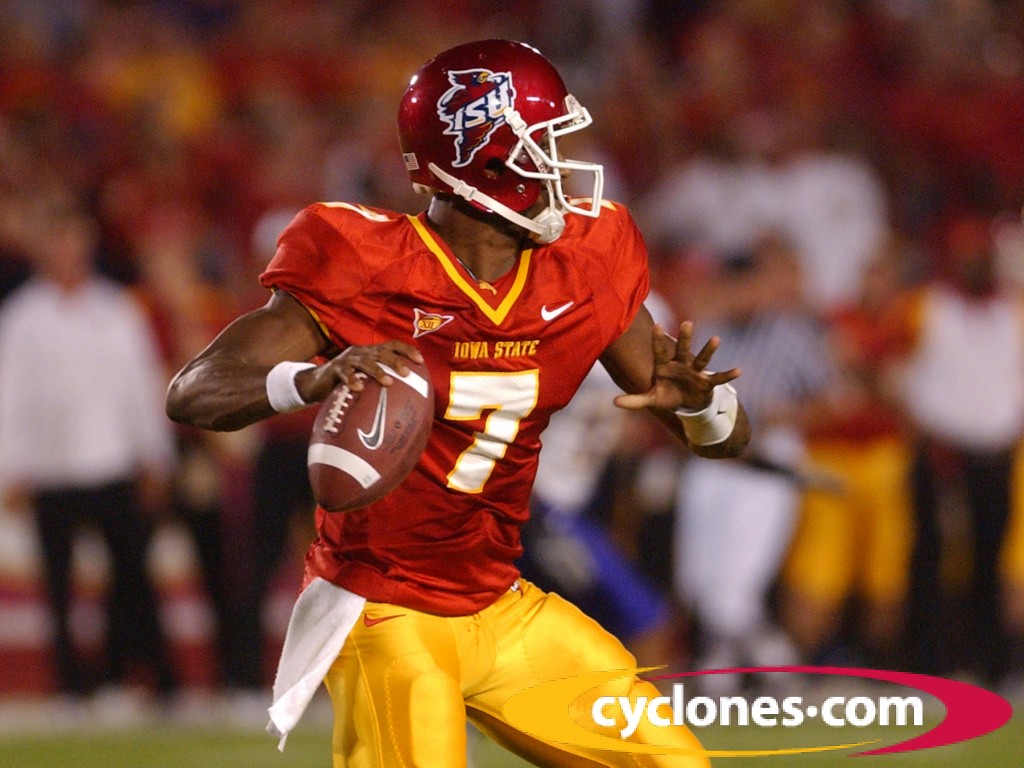
What failed with those unis was the pants were supposed to be like in this image and mirror those worn vs Iowa in the 2007 throwback uni game. And any new unis with gold pants need to mirror these either with one or two stripes:

I think over the past 100 years, Iowa State has proven they're partially color blind when it comes to what our school colors are.What failed with those unis was the pants were supposed to be like in this image and mirror those worn vs Iowa in the 2007 throwback uni game. And any new unis with gold pants need to mirror these either with one or two stripes:
View attachment 114354
The Rhoads unis were much better than the Mac unis.
I don't think it is that so much as they need to demand that Nike get the uni colors to exactly match those as intended on the I-State logo, especially with the gold which should be exactly the same as the 2007 throwback pants. The issue with Cardinal is to have the jersey/pants on the existing set of FB unis match up better with darker Cardinal shade on the helmets.I think over the past 100 years, Iowa State has proven they're partially color blind when it comes to what our school colors are.

Culbertson Kicks Iowa, 15-13 - Iowa State Athletics
AMES, Iowa?Senior kicker Bret Culbertson tied a school-record with five field goals, including the game-winner on a 28-yarder with 0:01 left on the clock, as...
This tells me we're as indecisive as my 7 year old... and that doesn't factor in the 100 different logos we've used.I don't think it is that so much as they need to demand that Nike get the uni colors to exactly match those as intended on the I-State logo, especially with the gold which should be exactly the same as the 2007 throwback pants. The issue with Cardinal is to have the jersey/pants on the existing set of FB unis match up better with darker Cardinal shade on the helmets.
Culbertson Kicks Iowa, 15-13 - Iowa State Athletics
AMES, Iowa?Senior kicker Bret Culbertson tied a school-record with five field goals, including the game-winner on a 28-yarder with 0:01 left on the clock, as...cyclones.com

Hell no. You really think the Rhoads ones are more McDonald's than the Mac unis? The Rhoads jerseys were designed after our 1977 uniforms.Yep. I’d take the Mac unis (minus yellow pants) over the Chiz/CPR unis 100x. I think those were some of the worst in the country during that time
Wow, unis are getting cookie-cutter really fast! At least they're going traditional
I absolutely LOVE these UTEP unis... as long as they also have a blue helmet and a white helmet option too. If they do... they are perfect as far as I'm concerned. Swap out the blue for our cardinal... beautiful! Can someone do that?