19 by my count if you include logos that incorporate either the school name (like ours) or the team name (like Ragin' Cajuns).View attachment 112685
There are actually quite a few schools that use the name


No forums found...
Site Related
Iowa State
College Sports
General - Non ISU
CF Archive
Install the app
How to install the app on iOS
Follow along with the video below to see how to install our site as a web app on your home screen.
Note: This feature may not be available in some browsers.
New Uniforms Revealed
- Thread starter CyTwins
- Start date
No forums found...
Site Related
Iowa State
College Sports
General - Non ISU
CF Archive
You are using an out of date browser. It may not display this or other websites correctly.
You should upgrade or use an alternative browser.
You should upgrade or use an alternative browser.
Yeah- I get it.. some might not even know who we were if you threw an older logo up there. So the branding works.View attachment 112685
There are actually quite a few schools that use the name
Like you said, maybe we just need to incorporate some of the older logos more


Adopting the "I-State" logo was one of the first big things Jamie did when he got here, so I don't see us moving away so long as he is still AD. And there has been some benefit to maintaining consistent branding for close to 20 years.how many signatures on petition . org do we need to get the university to get rid of the ISTATE logo?
time for it to go
While I don't think the I-State needs to be completely thrown away, we should retire the beveled versions of logo. The faux 3D logo trend was very popular in the early/mid 2000s, and has very much gone out of favor for simplified designs with fewer colors. The current 4-color I-State is dated, and I feel that it causes confusion as far as branding, specifically in what our official colors are. The 4-color logo uses two golds and two cardinals, without anything to distinguish what is the official color, and what is the accent. Additionally, the detail added by the beveling makes the logo less sharp and distinguishable from a distance.
I think we would be well served to retire the beveled versions and adopt the 2-color I-State primary logo. It keeps our longest used primary logo in service, while adapting it for modern design sensibilities.
Attachments

Last edited:
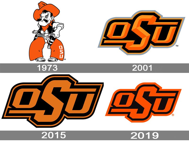
For a comparison to another peer school, look at how Oklahoma State has modified their logo. They removed the bevel in order to simplify the look, and adopted a higher contrast orange. Additionally, they make good use of Pistol Pete, the Star Badge, and paisley as part of their image.Adopting the "I-State" logo was one of the first big things Jamie did when he got here, so I don't see us moving away so long as he is still AD. And there has been some benefit to maintaining consistent branding for close to 20 years.
While I don't think the I-State needs to be completely thrown away, we should retire the beveled versions of logo. The faux 3D logo trend was very popular in the early/mid 2000s, and has very much gone out of favor for simplified designs with fewer colors. The current 4-color I-State is dated, and I feel that it causes confusion as far as branding, specifically in what our official colors are. The 4-color logo uses two golds and two cardinals, without anything to distinguish what is the official color, and what is the accent. Additionally, the additional detail added by the beveling makes the logo less sharp and distinguishable from a distance.
I think we would be well served to retired the beveled versions and adopt the 2-color I-State primary logo. It keeps the out longest used primary logo in service, while adapting it for modern design sensibilities.
We should be able to do the same by refining the "I-State" and bringing Walking Cy back into regular use.
I agree with your point entirely, but this sequence of words convinced me I was having a stroke....Additionally, the additional detail added...


Great examples. Similarly Texas Tech brings out a non-beveled version in their throwback uniforms and I love it.For a comparison to another peer school, look at how Oklahoma State has modified their logo. They removed the bevel in order to simplify the look, and adopted a higher contrast orange. Additionally, they make good use of Pistol Pete, the Star Badge, and paisley as part of their image.
We should be able to do the same by refining the "I-State" and bringing Walking Cy back into regular use.

I can't get past those horrible shoes. Give him cleats or talons.
Never got the obsession with the walking bird. How many schools have some sort of bird in their mascot, either a throwback or current?
How many schools have a tornado on their helmet or logo? To me thats easily gotta be where the focus should be
How many schools have a tornado on their helmet or logo? To me thats easily gotta be where the focus should be
Yeah, not great proof reading on my partI agree with your point entirely, but this sequence of words convinced me I was having a stroke.
how many schools are named the cyclones but have a bird mascot?Never got the obsession with the walking bird. How many schools have some sort of bird in their mascot, either a throwback or current?
How many schools have a tornado on their helmet or logo? To me thats easily gotta be where the focus should be
makes no sense but the logo is still sweet! haha
I LOVE all of these...although I prefer if the "cyclone" would be flat!
I imagine that any proof reading puts you immediately into the 90% percentile on CF.Yeah, not great proof reading on my part
Agree.how many schools are named the cyclones but have a bird mascot?
makes no sense but the logo is still sweet! haha
Miami Hurricanes (similar in that there is a windy storm involved) have a bird mascot (ibis, I believe) and a "U" for a logo.
While I don't disagree, it is hard to make a good visualization of a tornado or cyclone. Tornados are are inherently wild, chaotic, and disorganized which doesn't lend well to a clean and recognizable logo. Besides, we tried to make a new version of the tornado logo and ended up with the Bugle. Similarly Miami tried this version of a hurricane, while Tulsa just uses flags, and Carolina (NHL) uses a stylized version of the meteorology symbol.Never got the obsession with the walking bird. How many schools have some sort of bird in their mascot, either a throwback or current?
How many schools have a tornado on their helmet or logo? To me thats easily gotta be where the focus should be

That's how it was/is for most teams not named Ohio State, Oklahoma, Texas, etc. Jerseys weren't a huge deal in 2005 outside of Oregon.The good old days when people were so jacked that ISU *finally* got Nike uniforms, they overlooked the fact that ISU also got the generic off-the-rack Nike template.
We've never had worse jerseys than Chizik's final year with the yellow pants. The truest ketchup and yellow mustard look we've ever had. Luckily we fixed our cardinal under Rhoads. Just haven't quite got the yellow/gold right.
Definitely get what you mean, it's tough to do well. But my profile pic is more of what I was getting at. They had it so right in the 80s... Would love that to be our primary and something with the bird as a secondaryWhile I don't disagree, it is hard to make a good visualization of a tornado or cyclone. Tornados are are inherently wild, chaotic, and disorganized which doesn't lend well to a clean and recognizable logo. Besides, we tried to make a new version of the tornado logo and ended up with the Bugle. Similarly Miami tried this version of a hurricane, while Tulsa just uses flags, and Carolina (NHL) uses a stylized version of the meteorology symbol.

View attachment 112693
If I understand the history, Cy was selected by ISU students as the mascot.
If I also understand the history, naming the stadium in honor of Jack Trice was driven by the students (I was one who fought for it in the 1980s).
Maybe part of this process also should include students? Then again, isn't that actually what the university is there for?
But, college sports is a business, and teams and uniforms and logos are all business decisions anymore.


