

No forums found...
Site Related
Iowa State
College Sports
General - Non ISU
CF Archive
Install the app
How to install the app on iOS
Follow along with the video below to see how to install our site as a web app on your home screen.
Note: This feature may not be available in some browsers.
Stadium Construction 7/20
- Thread starter scclone3
- Start date
No forums found...
Site Related
Iowa State
College Sports
General - Non ISU
CF Archive
You are using an out of date browser. It may not display this or other websites correctly.
You should upgrade or use an alternative browser.
You should upgrade or use an alternative browser.


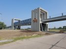


Still a missed opportunity to have stripe symbols on each side of the road. Maybe it would have been too much, but what’s two more pillars on each side and different heights instead of the three current ones at the same height.Hoping they go stripes on the other side
The JT stripes have been moreso adopted by the football program, not by the entire athletic department. It's a university gateway project, not just a football projectStill a missed opportunity to have stripe symbols on each side of the road. Maybe it would have been too much, but what’s two more pillars on each side and different heights instead of the three current ones at the same height.

IMO, the logo is too diminutive and proportionally inconsequential. It should be 1 1/2 times larger and nearer the top. But, as they say "it's better than nothing".
Feel like the uniform fanatics now have more to nitpick about.

Have to agree with you. The logos seem too small. I would also like to see them higher up.IMO, the logo is too diminutive and proportionally inconsequential. It should be 1 1/2 times larger and nearer the top. But, as they say "it's better than nothing".
That is a good point. I have not seen the bridge since March... so it has come a long way.You can't really appreciate the size of this thing until you've seen it in person. I'd say it's right about a quarter mile long.
We’ve been parking on campus but makes me want to fight traffic in public lots again just to use it.
I can't find a measurement for it, but I used a run mapping app that puts it right at .25 miles. Crazy.That is a good point. I have not seen the bridge since March... so it has come a long way.
I'm guessing that when you stand closer to the bridge, the ISTATE logos look pretty good. From a distance... whatever that is... the logos seem small compared to the size of the bridge.
I'm guessing that when you stand closer to the bridge, the ISTATE logos look pretty good. From a distance... whatever that is... the logos seem small compared to the size of the bridge.
The I-State logos are 10-11' tall.

I’m not going to complain but what people never seem to understand is it is proportions. It’s always about being proportional to the surroundings. Just because it is big enough to accomplish its goals doesn’t mean it looks right.I'm guessing that when you stand closer to the bridge, the ISTATE logos look pretty good. From a distance... whatever that is... the logos seem small compared to the size of the bridge.
I’ll be curious to how the logos look in person but I wish they would have gone a bit bigger.
You can't really appreciate the size of this thing until you've seen it in person.


Looks pretty much the same as the renderings

They don’t want them to detract from the Matt Campbell inflatable that will be going up on top of the stair towers—standing with one foot on each.IMO, the logo is too diminutive and proportionally inconsequential. It should be 1 1/2 times larger and nearer the top. But, as they say "it's better than nothing".
Last edited:
Need to leave room on the top half of the tower for the Big 12 championship banners!