That's what I'm sayin'!!!!!
Of course if we miss one of the ducks, a dog with a hok hat laughs at us.


Follow along with the video below to see how to install our site as a web app on your home screen.
Note: This feature may not be available in some browsers.
That's what I'm sayin'!!!!!
If he's wearing that, then shoot the dog.Of course if we miss one of the ducks, a dog with a hok hat laughs at us.


Good question. I don't think we were the higher rank team against ND last year, but we had the Home uni (b/c/c).
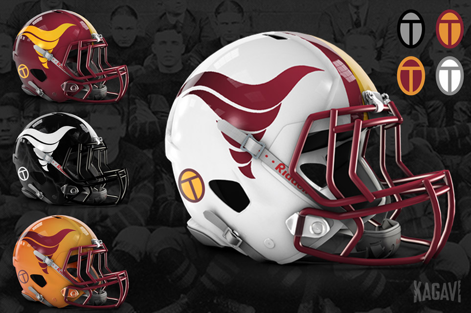
Unrelated. But recently I took some time to update "Blender Cy" I know there's a lot of people that really don't like the logo. Personally, I think with some updating, I'm a fan. Different for sure but IMO unique and totally ISU.
LMK what you think.
View attachment 79756
View attachment 79757View attachment 79758
View attachment 79759
Included some different options. This one is my favorite, cleaner the better IMO. View attachment 79760
I'm a youngerish fan (only 30) and these are hands down my favorite logo. I desperately want to go back to this
This. No black, please.Yeah I thought I saw higher ranked team for fiesta is home. I’ll try to find that.
Since Oregon is green I really think it’s CCC or WCC
Don't they pretty much have to have better uniforms on than ours? We fund their athletic department by wearing Nike Uniforms.
Hoping for red pants, red jersey and a chrome gold hat with I-State stenciled for this one. Break out something new like we did for the Liberty Bowl.
That said, R-R-R is my prediction
Unrelated. But recently I took some time to update "Blender Cy" I know there's a lot of people that really don't like the logo. Personally, I think with some updating, I'm a fan. Different for sure but IMO unique and totally ISU.
LMK what you think.
View attachment 79756
View attachment 79757View attachment 79758
View attachment 79759
Included some different options. This one is my favorite, cleaner the better IMO. View attachment 79760
I cringe when I see the bird in a blender and the CrinerClone at our games. Hate them.Always hated that the E in State was capitalized. Looks terrible. JMO. This logo is too busy - it's a 90's era ish logo (in which it is ridiculous). It's confusing. Are we the cardinals? Are we tornado birds? This was the common backlash from our conference brethren when they saw this logo. Also, the ******* navy blue?
The I-State logo is a sound traditional looking logo and is the BEST logo ISU has or has ever had. Very recognizable throughout the country.
Also, you never see this logo around anymore. Go to any ISU clothing store and it is not featured, and for good reason. The old school walking cy and 80s tornado are on vintage shirts. This logo above, hasn't aged well.
In fact, the only good thing that is of sound remembrance for this logo is the 2000 FB team (9-3) and the 2000 BB Team (32-5) that should have won the Natty but were jobbed by horrible seeding and officiating in the Elite 8.