I’ll go with CMC, no questions asked.Mistake.


No forums found...
Site Related
Iowa State
College Sports
General - Non ISU
CF Archive
Install the app
How to install the app on iOS
Follow along with the video below to see how to install our site as a web app on your home screen.
Note: This feature may not be available in some browsers.
New Uniforms Revealed
- Thread starter CyTwins
- Start date
No forums found...
Site Related
Iowa State
College Sports
General - Non ISU
CF Archive
You are using an out of date browser. It may not display this or other websites correctly.
You should upgrade or use an alternative browser.
You should upgrade or use an alternative browser.


He’s a football coach. Not a fashion designer.I’ll go with CMC, no questions asked.
He’s a football coach. Not a fashion designer.
it’s football, not Barbie
There you have it. And for the most part I like our monochrome black look better than what I’m seeing w most college or pro teams’ attempt at black. Those I think are too busy w interjection of team colors and/or white.CMC didn’t want red on the blacks or it would be there.
Campbell has it the way he wants it for now. It has been monochrome blk and white except for blk helmet w c/g stickers on occasion. He has not mixed blk w c/g otherwise. That mix is more me or us talking about it.
I would not look to emulate the Arizona Cardinals.
They have one of the most confused identities and worst uniforms in professional football.
They have one of the most confused identities and worst uniforms in professional football.
My friend made these last week. He could not get the font correct but I thought the colors were almost perfect. He also considered the I-State logo on the golds like two seasons ago. Now, if we could only go with Jordan Brand gear.
Thoughts?
Thoughts?
Attachments


My friend made these last week. He could not get the font correct but I thought the colors were almost perfect. He also considered the I-State logo on the golds like two seasons ago. Now, if we could only go with Jordan Brand gear.
Thoughts?
Those look good. I like our current BB uniforms as they are (other than the "green-black"), but I'd be jazzed about these.
I used to be gray-background resistant, but now that we seem to be pushing black combos all the time, I think it's a good alternate option. I might prefer it slightly lighter gray, but that isn't a big deal.
Addition of the white with gold trim on the cardinal uniform (but still prominent gold striping) is sharp. (And I like our current cardinal/gold with no white version). Also, the white trim on the gold is a nice subtle touch.
Yes that Away game they had against Texas was the one I saw. Their helmets did look a little more red than orange on TV. Definitely a different shade of orange.
Why would it be so hard for us to have a couple a shades of gold? One current and one darker? Would the earth stop rotating? I think it would solve a lot of problems, make everyone happy. What do I know.

Those are cool. That should be OSU's primary home combo.
Those look good. I like our current BB uniforms as they are (other than the "green-black"), but I'd be jazzed about these.
I used to be gray-background resistant, but now that we seem to be pushing black combos all the time, I think it's a good alternate option. I might prefer it slightly lighter gray, but that isn't a big deal.
Addition of the white with gold trim on the cardinal uniform (but still prominent gold striping) is sharp. (And I like our current cardinal/gold with no white version). Also, the white trim on the gold is a nice subtle touch.
This x1000. We need to add some white into our cardinal football uniforms.
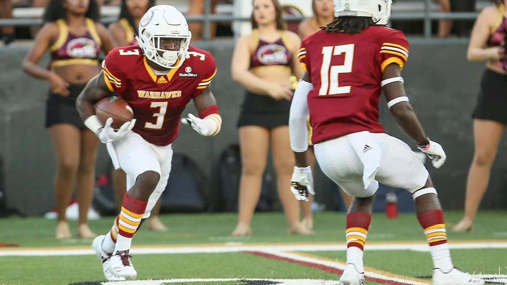
I really like ULM's look this season.....

This x1000. We need to add some white into our cardinal football uniforms.
I really like ULM's look this season.....
Those gold pants suck.
Those gold pants suck.
That's like...... your opinion man.
Actually they do kinda suck though. They need some red and white stripes down the side.
Those gold pants suck.
gold pants always suck.
Our current B-ball uniforms are awful IMO. These would be a major improvement. TBH I would be thrilled if we went back to our last set as they were spectacular.Those look good. I like our current BB uniforms as they are (other than the "green-black"), but I'd be jazzed about these.
I used to be gray-background resistant, but now that we seem to be pushing black combos all the time, I think it's a good alternate option. I might prefer it slightly lighter gray, but that isn't a big deal.
Addition of the white with gold trim on the cardinal uniform (but still prominent gold striping) is sharp. (And I like our current cardinal/gold with no white version). Also, the white trim on the gold is a nice subtle touch.
Our current B-ball uniforms are awful IMO. These would be a major improvement. TBH I would be thrilled if we went back to our last set as they were spectacular.
Agree with this. Our current MBB uniforms are turrible.
Our current B-ball uniforms are awful IMO. These would be a major improvement. TBH I would be thrilled if we went back to our last set as they were spectacular.
I like both, actually, for different reasons. I still like current ones a little better.


Those Ejim ones are SWEET....

Especially when compared with the current ones.....

The "tornado" sides on the current ones look awful.
I love how "Iowa State" is printed straight across on Ejim's, versus the curved "Cyclones" on our current ones. I also like the wide shoulder on Ejim's versus the really skiny shoulder strap look on our current ones.
Especially when compared with the current ones.....
The "tornado" sides on the current ones look awful.
I love how "Iowa State" is printed straight across on Ejim's, versus the curved "Cyclones" on our current ones. I also like the wide shoulder on Ejim's versus the really skiny shoulder strap look on our current ones.
The cut of the current ones look bad and the design only reinforces the cut. They look like wife beaters.Those Ejim ones are SWEET....
Especially when compared with the current ones.....
The "tornado" sides on the current ones look awful.
I love how "Iowa State" is printed straight across on Ejim's, versus the curved "Cyclones" on our current ones. I also like the wide shoulder on Ejim's versus the really skiny shoulder strap look on our current ones.
I also think the color appears off with the current ones. The description of them has always been the candy cane stripes. They just don’t scream Iowa State to me.
Those Ejim ones are SWEET....
Especially when compared with the current ones.....
The "tornado" sides on the current ones look awful.
I love how "Iowa State" is printed straight across on Ejim's, versus the curved "Cyclones" on our current ones. I also like the wide shoulder on Ejim's versus the really skiny shoulder strap look on our current ones.
I could do without the tornado side-stripes. I know what the goal was but may overtake the full look too much. Similar concept and more subtle would've been better.
I could do without the tornado side-stripes. I know what the goal was but may overtake the full look too much. Similar concept and more subtle would've been better.
The cut of the current ones look bad and the design only reinforces the cut. They look like wife beaters.
I also think the color appears off with the current ones. The description of them has always been the candy cane stripes. They just don’t scream Iowa State to me.
You guys are making me second-guess my preference between current and former (a little, anyway).
I've hadn't compared the cut of each. Former design probably does look better.
I actually like the cardinal tone on the current uniforms.
The way basketball uniforms typically are updated, we'll probably see new ones soon, maybe even by next season.