

No forums found...
Site Related
Iowa State
College Sports
General - Non ISU
CF Archive
Install the app
How to install the app on iOS
Follow along with the video below to see how to install our site as a web app on your home screen.
Note: This feature may not be available in some browsers.
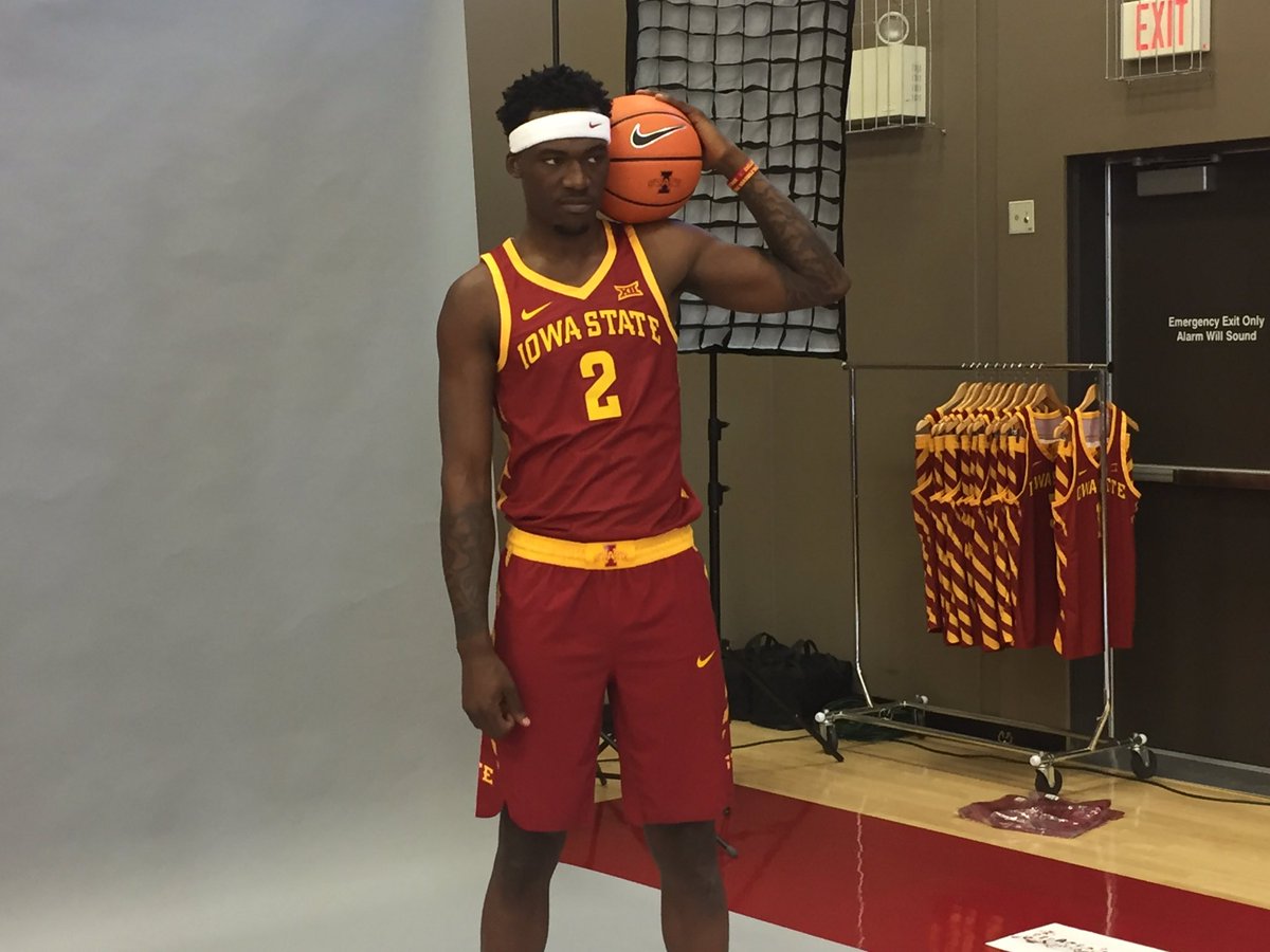
New uniforms?
- Thread starter Thompsonclone
- Start date
No forums found...
Site Related
Iowa State
College Sports
General - Non ISU
CF Archive
You are using an out of date browser. It may not display this or other websites correctly.
You should upgrade or use an alternative browser.
You should upgrade or use an alternative browser.


When looking at the clipped photo that I originally quoted, that was the first jersey that popped into my mind.We drafted Lebron?
So, do they put Hilton South on the away jerseys?
Not surprising when we have crappy logos on apparel with the likes of severed cy head in toilet and blenderView attachment 50748 Speaking of appearal and shoe money, how is it we are near the bottom:
I updated the Hilton Magic logo to align with the current Cy Head and new Cyclone logo, as well as the beveled I-State school logo.
Tongue in cheek, of course, but this proves that simple, solid designs are the best and most timeless. The only quibble I have about the Hilton Magic logo is that the columns disappear easily at distance. It's perfectly fine for a fun secondary, secondary logo, though!
Tongue in cheek, of course, but this proves that simple, solid designs are the best and most timeless. The only quibble I have about the Hilton Magic logo is that the columns disappear easily at distance. It's perfectly fine for a fun secondary, secondary logo, though!
Attachments

Not bad. I think it needs a little more white. Possibly around the letters and numbers.here's my guess at a gold option.
View attachment 50748 Speaking of appearal and shoe money, how is it we are near the bottom:
It also is a good sign that we weren't up to any shady business paying players haha.
The Hickory uniforms come to mind when I see this. Not that there's anything wrong with that either.
slightly more side view in this one:
I love these, a lot a lot. But, I can't get over how much the red top looks like the Cleveland Red's from the past couple years. That is all.
Can't wait to see the golds!
I love these, a lot a lot. But, I can't get over how much the red top looks like the Cleveland Red's from the past couple years. That is all.
Can't wait to see the golds!
Agree on all fronts - looks just as you posted that in this thread on post #96. I guess with similar colors, and 'classic templates', that is to be expected. Both sets are gorgeous so far!
We should also remember the bullets we've dodged (in more ways than one I suppose, ahem, adidas) in recent years, like these:
https://sports.yahoo.com/blogs/ncaa...eiving-lots-of-hate-on-twitter-015537285.html