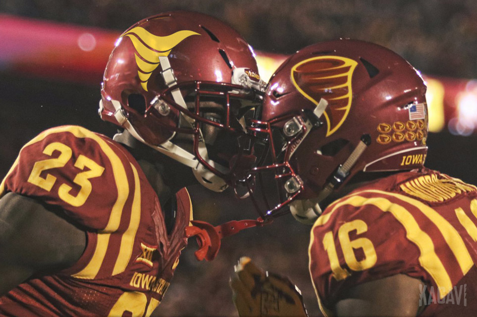
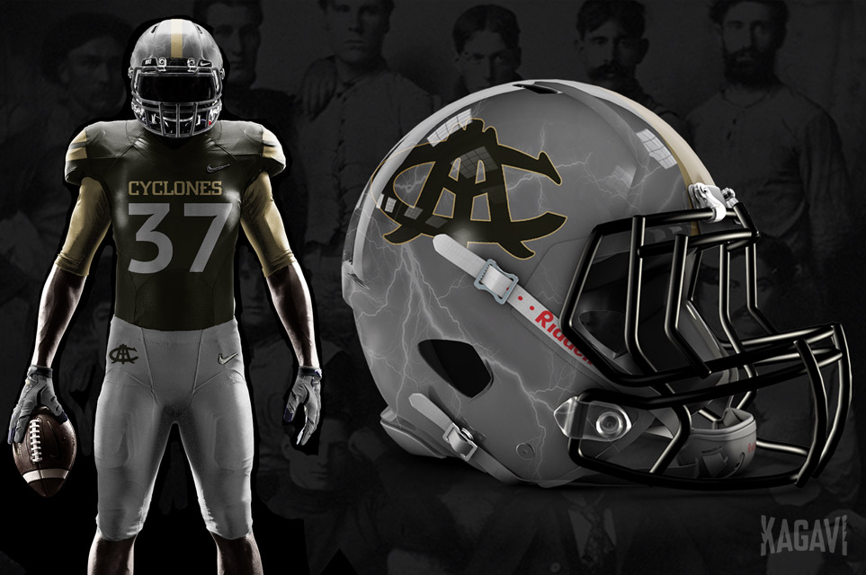
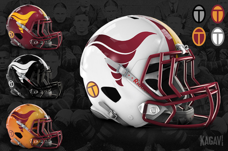
Wrote a thing about the new Cyclone logo and how ISU can properly honor its heritage through design.
Does the new logo fit the bill? Really want to see the reaction of you good people here to the story. Let's discuss!
Some teaser images from the story:


I'm fine with the uniform you present as an example, but please do not try to compare the Criner era to any other. That was a bad time where ISU football really was damaged in ways that took a couple decades to fix. True, it was not all Criner's fault, but still he was the coach when it happened.


