

No forums found...
Site Related
Iowa State
College Sports
General - Non ISU
CF Archive
Install the app
How to install the app on iOS
Follow along with the video below to see how to install our site as a web app on your home screen.
Note: This feature may not be available in some browsers.
Current ISU color info?
- Thread starter Yaz
- Start date
No forums found...
Site Related
Iowa State
College Sports
General - Non ISU
CF Archive
You are using an out of date browser. It may not display this or other websites correctly.
You should upgrade or use an alternative browser.
You should upgrade or use an alternative browser.
Color Palette - Brand Standards
The Iowa State University customized color palette reflects the clarity and depth of our values, and it is deeply rooted in the university’s land-grant mission. Consistent and appropriate use of these colors will create a strong and consistent visual presence for the university. This established...
 www.brandmarketing.iastate.edu


Color Palette - Brand Standards
The Iowa State University customized color palette reflects the clarity and depth of our values, and it is deeply rooted in the university’s land-grant mission. Consistent and appropriate use of these colors will create a strong and consistent visual presence for the university. This established...
That's the university palette. The athletic palette is different. I don't know if they still do, but years ago they used to publish brand standards for athletics with color codes in them. I've got a couple of PDFs from years ago.
Thanks for the link. Pretty useful. I also got a chuckle out of this in the link:Color Palette - Brand Standards
The Iowa State University customized color palette reflects the clarity and depth of our values, and it is deeply rooted in the university’s land-grant mission. Consistent and appropriate use of these colors will create a strong and consistent visual presence for the university. This established...
Colors associated with other public institutions, such as the one on the eastern side of the state, should not be used. Even though gold is one of Iowa State's primary colors, use of black and gold together should be avoided.
Well, I finally found this. It has a different info. Is one for the University and one for the Athletic Dept?Color Palette - Brand Standards
The Iowa State University customized color palette reflects the clarity and depth of our values, and it is deeply rooted in the university’s land-grant mission. Consistent and appropriate use of these colors will create a strong and consistent visual presence for the university. This established...
That's the university palette. The athletic palette is different. I don't know if they still do, but years ago they used to publish brand standards for athletics with color codes in them. I've got a couple of PDFs from years ago.
This is linked on the Cyclones.com Trademarks page so I'm pretty sure that is what the AD uses.
This is linked on the Cyclones.com Trademarks page so I'm pretty sure that is what the AD uses.
Yep, that looks like the current version of the PDFs I downloaded years ago.
So we have 4 official shades of Cardinal and 3 shades of Gold. Why? Can someone with some design background or better versed in color theory explain why the athletics colors and the university colors are different? Wouldn't a unified color scheme with fewer versions be better for branding and recognition?

Seeing it laid out this way reaffirms my belief that ISU needs to retire the 4 color "I-State" logo. I would even go all the way to completely ditch the bevel, and just go the with 2 color and the stencil versions of "I-State".
My reasoning on this is that in the beveled versions of the "I-State" the actual Cyclone Cardinal and Gold are used roughly the same amount with their Alt. Cardinal and the Highlight Gold counterparts. Our Primary Athletic Mark doesn't make it clear what our actual colors are, and someone not intimately familiar with our colors could be forgiven for thinking the lighter colors are our primaries.
So we have 4 official shades of Cardinal and 3 shades of Gold. Why? Can someone with some design background or better versed in color theory explain why the athletics colors and the university colors are different? Wouldn't a unified color scheme with fewer versions be better for branding and recognition?
View attachment 99240
Seeing it laid out this way reaffirms my belief that ISU needs to retire the 4 color "I-State" logo. I would even go all the way to completely ditch the bevel, and just go the with 2 color and the stencil versions of "I-State".
My reasoning on this is that in the beveled versions of the "I-State" the actual Cyclone Cardinal and Gold are used roughly the same amount with their Alt. Cardinal and the Highlight Gold counterparts. Our Primary Athletic Mark doesn't make it clear what our actual colors are, and someone not intimately familiar with our colors could be forgiven for thinking the lighter colors are our primaries.
View attachment 99241
The athletic department essentially went its own way when it unveiled the "I-State" logo and branding in 2007, and created its own new color palette. University marketing was not thrilled. Branding people will tell you that yes, you want to be unified and consistent across the entire university but in practical terms there's so little difference between these shades that it doesn't much matter. Wearing black and white uniforms is a far greater branding crime than having multiple shades of cardinal and gold.
Why do they have multiple shades? My guess is that it's done because different use cases allow for different levels of complexity. The four-color version with the beveling and subtle but visible differences in shade colors works in some applications, but certain things cost more to print or produce with more colors, so they offer a stripped-down two-color version. That sort of thing.
The I-State logo needs updated, and the 2-color example above is closer to what it should be. Better, more traditional colors and not as hokey. The current logo looks cheap and of a different era in tech/design.
It's the best logo we've had as far as building consistency in branding and national recognition, but that has more to do with the success of our teams than it being a great logo. Personally, I rarely buy gear with the logo, and if I do, it's small. If we moved to the 2-color logo, I would buy more. I know it's a small change, but it makes a difference.
It's the best logo we've had as far as building consistency in branding and national recognition, but that has more to do with the success of our teams than it being a great logo. Personally, I rarely buy gear with the logo, and if I do, it's small. If we moved to the 2-color logo, I would buy more. I know it's a small change, but it makes a difference.
Last edited:
I Sneak in the ol' RBG 130-36-52 and RBG 253-202-47 colors in all of my presentations
A little head nod to the Cardinal and Gold
Loyal
Forever
True
A little head nod to the Cardinal and Gold
Loyal
Forever
True
The I-State logo needs updated, and the 2-color example above is closer to what it should be. Better, more traditional colors and not as hokey. The current logo looks cheap and of a different era in tech/design.
It's the best logo we've had as far as building consistency in branding and national recognition, but that has more to do with the success of our teams than it being a great logo. Personally, I rarely buy gear with the logo, and if I do, it's small. If we moved to the 2-color logo, I would buy more. I know it's a small change, but it makes a difference.
EXACTLY! Our 4-color logo or whatever looks like it is dated...and not in a classic cool kind of way!
I also use official pantone text in all my work spreadsheets...I Sneak in the ol' RBG 130-36-52 and RBG 253-202-47 colors in all of my presentations
A little head nod to the Cardinal and Gold
Loyal
Forever
True
")
So we have 4 official shades of Cardinal and 3 shades of Gold. Why? Can someone with some design background or better versed in color theory explain why the athletics colors and the university colors are different? Wouldn't a unified color scheme with fewer versions be better for branding and recognition?
View attachment 99240
Seeing it laid out this way reaffirms my belief that ISU needs to retire the 4 color "I-State" logo. I would even go all the way to completely ditch the bevel, and just go the with 2 color and the stencil versions of "I-State".
My reasoning on this is that in the beveled versions of the "I-State" the actual Cyclone Cardinal and Gold are used roughly the same amount with their Alt. Cardinal and the Highlight Gold counterparts. Our Primary Athletic Mark doesn't make it clear what our actual colors are, and someone not intimately familiar with our colors could be forgiven for thinking the lighter colors are our primaries.
View attachment 99241
On the logo it's primarily for the light and shadow but there are a lot of uses for it in different designs. Sometimes colors are limited or cost $ so you can see the 2, 3 and 4 color options. Once you get to 4 color you can use CMYK anyway but the spot colors can still pop a little more.
I think the 4C I STATE is very valuable if you want to put it solid colors other than white. I'd have done the same.
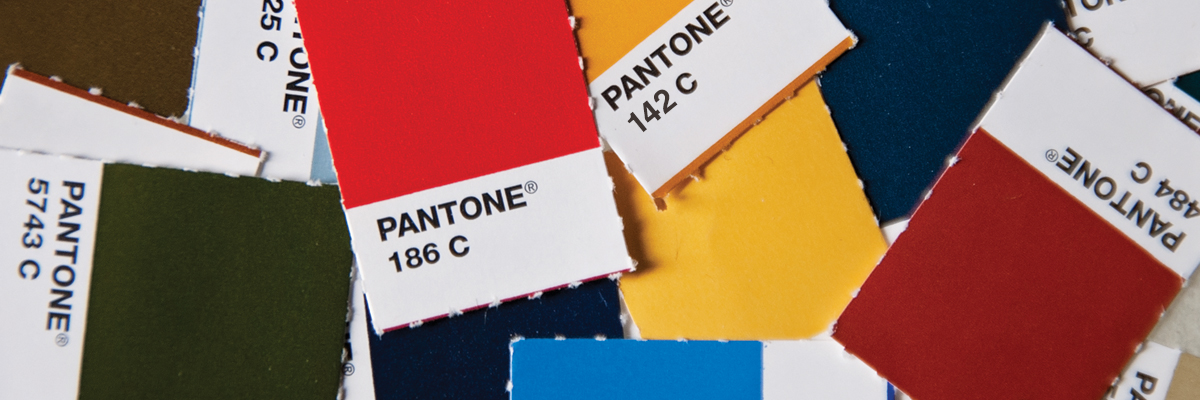
Pantone C is solid color reference for print on gloss or semi gloss
Pantone U is solid color reference for print on uncoated paper or flat finishes
RGB is screen color
CMYK is full color printing, with these 4 colors good CMYK print and RGB basically identical but in other cases a lot of RGB colors can't be replicated in CMYK
I'm sure the full manual probably states if the 4C or 2C is the primary mark. If it's on a white background I'd say it's matter of preference. If it's on a solid red or solid yellow background I think the 4C one is better. If it's on a texture the 2C is probably better, but busy texture is probably forbidden. My guess is there's another page that shows it on colors and how to use on colors.
My program at ISU focused on stuff like this but I went more toward product design over the years. Even in product design I'm constantly using these types of branding guides, just not creating the systems and marks myself very often. In product design a big challenge is you can match something perfect across 3-4 different materials...then in different light or in photographs it looks like it doesn't match. A lot of times when our fans complain our uni elements don't match on TV, the items may actually match in person. In my previous position I had a lot of nylon/synthetic apparel that always photographed different than it looked in actual life next to things that were more solid or cotton-like texture and I'm sure football unis and helmets have a lot of that challenge.
Last edited:
I like the bevel, but could live without it. (That probably sounds contradictory).Ditch the bevel. Let Texas Tech have it.
I think it's more well done on ISU and OKSt than Tech but the italic nature of OKState's logos creates problems for their stuff I'm sure.I like the bevel, but could live without it. (That probably sounds contradictory).
The beveled I State is just stupid. They need to just go with the 2 color and/or 1 color versions, and retire the 4 color and 3 color versions. I have never liked the beveled versions. It just doesn't look that good. I guess maybe for the University use, but never should be used for the AD. And of course it just makes the color palette extra complicated having to have the secondary colors and shades for the bevels.
Again this is why I have liked the retro logos of the 80s they just look more classic, and clean, and maintain that traditional look.
Again this is why I have liked the retro logos of the 80s they just look more classic, and clean, and maintain that traditional look.