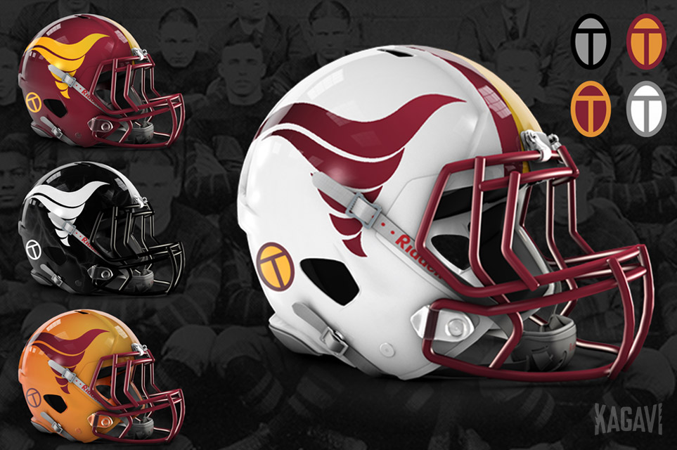
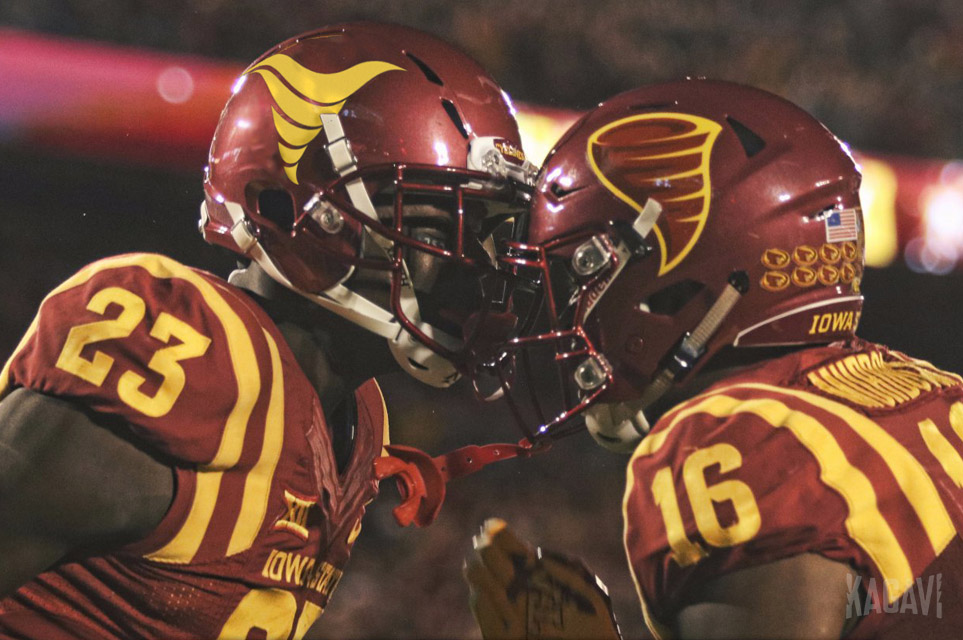
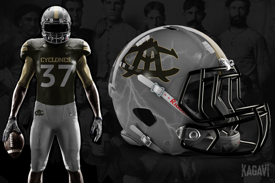
Wrote a thing about the new Cyclone logo and how ISU can properly honor its heritage through design.
Does the new logo fit the bill? Really want to see the reaction of you good people here to the story. Let's discuss!
Some teaser images from the story:
Does the new logo fit the bill? Really want to see the reaction of you good people here to the story. Let's discuss!
Some teaser images from the story: